DIRECTV’s new HD menus look a lot better than the older menus, and the reason is simple: instead of being created at a single size, DIRECTV’s new menus are created separately for 480i, 720p, and 1080i content. In other words, when you are watching a standard definition channel, you’ll get one set of menus, and when watching a high-definition channel you’ll get a different set. You’ll always get the best menus for the channel.
The secret is called “Native On.” This is a unique technology that DIRECTV and a few other providers use. Your TV probably has a much more expensive video processing system than your DVR, and using “Native On” sends programming to your TV in the way it was made: standard definition TV gets sent at standard definition, while HD programming gets sent at high definition. You can try this out yourself and see if it makes a difference.
To turn Native on:
Press {MENU} then arrow down to “Settings & Help.” Press {SELECT}.
With “Settings” highlighted, Press {SELECT} again.
Arrow down to “Display” and press {SELECT} again.
Arrow down to “Video” and press {SELECT} again.
With “Native” highlighted, press {SELECT} and if “Off” is highlighted, arrow down to “On” and press {SELECT}.
Press {EXIT} to go back to Live TV.
There is a faster and easier way to do this, but it’s an “unsupported” option so it may not always work: Press and hold {FORMAT} until the screen goes black and comes back on. This will turn Native Off if it’s on, and On if it’s off.
Once you have Native On, you can decide if it’s a better choice for you. Let’s look at how the menus look at different resolutions.
Here’s what we did: The 480i and 1080i menus were photographed by pointing a camera at a 1080p television. The 720p menu was photographed by pointing a camera at a 720p television. Any differences in color or brightness are due to the difficulty in photographing a TV screen.
480i
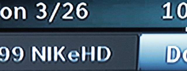
The new menus don’t look really spectacular at 480i. There is a lot of blurring and the overall effect is that text is harder to read. It seems darker with the same settings on the TV since the letters aren’t really well formed. The new menus use a thinner font than the old menus so it doesn’t seem as bright.
720p
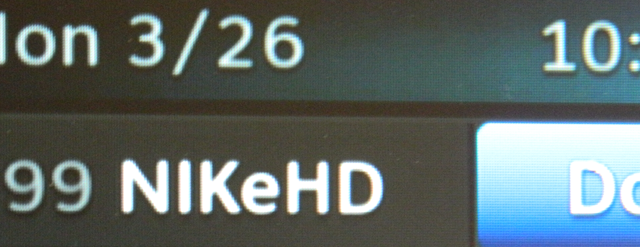
At 720p, the letters are much more clearly formed. On some 1080p TVs, 720p menus may seem a little darker or blurrier than 1080i menus for the same reason that the 480i menus look darker. The lines are thinner and not as well formed. However, the 720p menus are overall very legible no matter what TV is used.
1080i/1080p
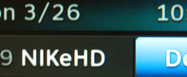
1080i menus are used for 1080i and 1080p programming. The letters are clear and bright with lots of contrast. Overall, this is the best way to look at the menus, and if the look of the menus is the most important to you, you can turn Native OFF and keep your TV at 1080i resolution so you’ll get the HD menus no matter what programming is there.
Let’s take a look at the letters up close.
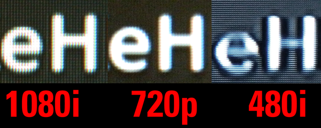
Looked at very closely, there’s actually very little difference between the 720p and 1080i menus. DIRECTV does a good job of rendering text cleanly regardless of which of these resolutions is selected. However, with the 480i text, it’s really clear that the letters are malformed and that rounded areas are darker than straight lines.
DIRECTV could probably do a better job of rendering 480i text. They could use a thicker font for standard-definition programs, or pump the brightness of the letters up a bit. But, you have to ask yourself, how important is it? The menus are still plenty legible and looking forward to the future, standard definition is probably going to be a lot less important. I’m glad they didn’t spend a lot of time on the 480i menus.