

Take a look at this photo. It comes from engadget’s 2011 review of the original DIRECTV app for iPad. Sadly my own review, published on another site days earlier, is no longer available online. There’s something… familiar here. Can you see it?
Grey, grey, logos, grey
This guide was part of the original app for iPad and let you change channels using the app’s included remote. Both the guide and the remote are still part of the app now, seven years later. It’s gotten even greyer now:
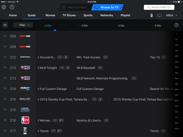
Take a look at both images, though. See the overabundance of grey? See how the channel numbers are on the left and the logos are on the right? See that the channel list is lighter than the rest of it? Does it remind you of anything?
DIRECTV’s new Genie menus, maybe?
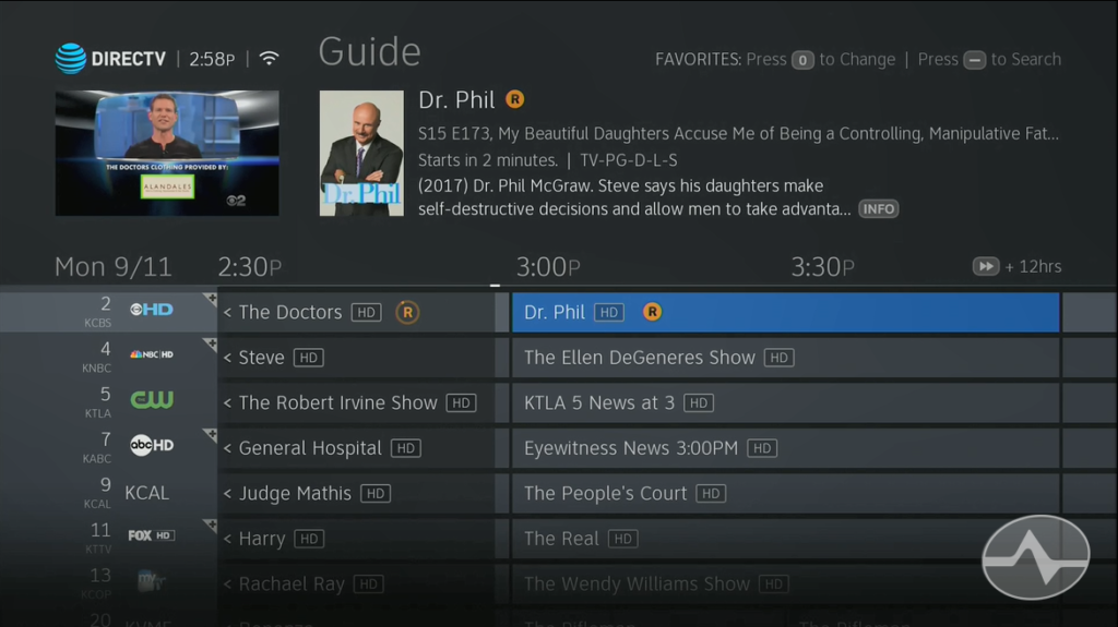
Is it possible that DIRECTV’s new user interface has been in the works a lot longer than we realized?
DIRECTV and AT&T people tell me all the time that consistency is important. They have said this for years now. Branding is important, consistency is important, it’s all part of the user experience. I know a lot of the work that’s being done today on the back end with DIRECTV is all about creating an enveloping and consistent experience.
The walled garden no more
A decade ago, a consistent experience meant bringing all the features into one box. DIRECTV spent years integrating features like Pandora, YouTube support, media and photo sharing and apps into its DVRs. However, many people decided on their own that their phones or streaming boxes were a better place for those features. I suspect that’s why DIRECTV streamlined things in the latest menus.
Today, the consistent experience means the opposite. Instead of bringing everything into one box, it means bringing the DIRECTV look and feel to multiple devices. Right now there’s some commonality between DIRECTV Satellite, DIRECTV NOW, and the DIRECTV apps for phone and tablet. There’s a certain family resemblance, brought on partially by the use of common colors like grey and blue.
Maybe that’s been part of the plan all along. While there are certainly many, many people who’ve been vocal about the latest move in DIRECTV satellite, I personally think it’s a matter of tweaking. No one is really saying they miss the purple and blue backgrounds of the old guide. They’re saying they’re having trouble reading the text, and that’s something you can tweak.
So does that mean they’ve been punking us?
Of course not. This is not evidence of some massive conspiracy, and it’s not like they were trying to give us spoilers for the new guide back in 2011. (On the other hand, if they had invited Mark Ruffalo to comment…) It’s far more likely that there’s been a slow movement in the direction of a black guide with logos, and it’s something that they have been moving toward all along. I think there have been comments now saying that perhaps there needs to also be some focus on channel names as well, and I can see evidence of those tweaks happening. I can say for sure though, it’s certainly not an evil conspiracy.


I’m one of the few that actually likes the new GUI. I wonder what that iPad app would look like on a Genine?
A conspiracy is a secret plan (100% true since had they obviously spoke to NO ONE who uses DirecTV) to do something harmful (not only with the unusability of their product, but disrespectful attitude in customer service). The “evil” part is the total AT&T organization from President at the TOP and Management to the idiots assigned to check “PROBLEM SOLVED” box when responding to complaints on their website, when indeed, this is the farest thing from the truth! DUMP AT&T/DIRECTV NOW!