Oh those kooky people at WatchMojo. I have no idea how they manage to put out so much content. And the funny thing is, it’s pretty much all good. It’s family-friendly and thought-provoking. While WatchMojo won’t help you heal the world or get along better with your family, you can count on them for a daily does of just plain smiles. And let’s be honest, there’s nothing wrong with that.
The thing about logos
Eagle-eyed readers of this blog will remember that we changed our logo about a year ago. Here’s the old one, in case you forget:

It was a riff of our corporate parent, Solid Signal, and featured a heartbeat-like signal inside a fairly 2000s-ish oval. Hey, we weren’t the only ones with an oval, right?
Our new logo was designed inhouse to convey interconnection, multiple disciplines, and a sharp, contemporary look. A lot of discussions went into the way it looks and the message it sent. That puts us in good company: all the best logos have a message of some sort inside them.
For example, I like pointing out that the old International Harvester logo not only looks like an “I” and an “H” but also like a person riding a tractor toward you. Since the company sells tractors, it’s pretty cool.

Other hidden messages in logos
This is where the people from WatchMojo come in. They’ve found ten hidden messages in logos. Some make sense. Some, like the Dodge Viper logo, became an instant joke and actually hurt the brand. Take a look:
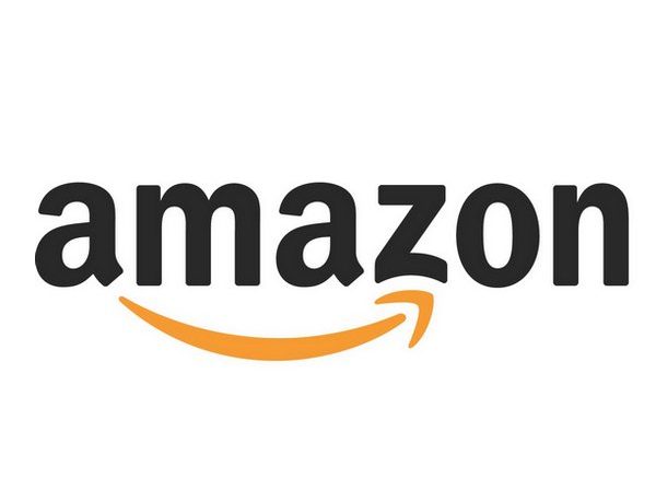
No question that a good logo will help and a bad logo will hurt, but sometimes a logo is such genius that you don’t even notice. Example:Amazon.
Yes, Amazon

First of all we have to acknowledge that Amazon’s logo is pretty 90’s-tastic. It was actually designed in the 2000s but that chunky friendly text looks like it’s right off a Power Rangers VHS tape.
But more importantly, it was designed at a time when Amazon mostly sold books. Remember that? Remember the days when everything in the world wasn’t on Amazon?
Amazon’s logo hides two things in its deceptively simple design. The orange arrow points from A to Z, which is pretty much what you’d want in a bookstore. Second, the arrow is also a smiling face, implying you’ll be happy with your purchase. I’m not saying it became the biggest online merchant in the whole history of history because there’s a smart hidden message in the logo, but let’s say it didn’t hurt.
Oh by the way, because I know you shop on Amazon (everyone does), you might want to try this selection of the most popular Solid Signal products there too!


