It was around this time in 2015 that we started to see the new DIRECTV branding that we still use. If for some reason you’re having trouble picturing it, I mean this:

Bitter party of one…
In this 2015 editorial, I looked back at DIRECTV’s most popular logo (although not its first) and pointed out that, by adding AT&T’s globe to the existing DIRECTV text, some advertising agency probably made a kajillion dollars. Heck, I would have done it for only a quarter-kajillion. That logo, as quickly envisioned as it was, has stuck with us for four years, though, so there must be something to it.
Branding is important
Despite my 2015 self’s bitterness, I do acknowledge that branding is important. AT&T’s globe is an evolution of one of the most recognizable logos in history. It, and the logo that preceded it, were both done by perhaps the most influential logo designer in history, Saul Bass. He drew this:
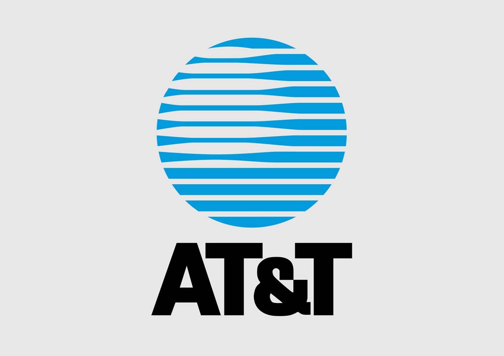
which in retrospect has held up pretty darn well for being about 40 years old. It replaced this one, which at one point was more identifiable than the American flag according to some studies:

Honestly, that’s still a damn good logo. It’s 50 years old and looks brand new.
When you brand your products right, you help your customer understand what you do and how all your stuff is connected. The globe logo (called “the Death Star” at the time) made the point that the world is electronic and that AT&T is a leader in it. That message still works today.
But what of DIRECTV’s old logo?
Yes, I still have a soft spot for the old DIRECTV logo, even though it became an effects-laden mess in its later incarnations:
There’s a wide screen, a world, a letter “D,” and in the white space, a representation of a cyclone. A cyclone (another name for a tornado) may be destructive, but it is also a powerful force that comes from the sky and reaches your home (well hopefully not but you get the point.) There’s a lot to like about this logo and I think it was well implemented.
No, it didn’t fit in the AT&T ecosystem and it was important that it was changed. I’m glad they didn’t try to somehow morph the two together. That would have been awful.
What’s the next evolution?
That’s hard to know. AT&T has moved mostly away from even mentioning the DIRECTV name, instead putting the globe by itself on most receivers and on the software. That’s not terrible — it says that people recognize that logo so well that you don’t need to say anything else.
That’s not such a bad thing.

