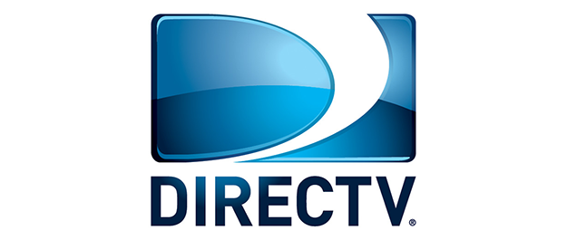
Yeah it’s gone, possibly for good. You might notice that this site and our parent SolidSignal.com have started using the new DIRECTV branding. In case you haven’t been paying attention, it looks like this:
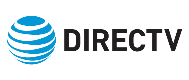
This is the official “lockup” (that’s what the pro’s call it) for all DIRECTV products, although the “now part of…” is optional. The point is that it came down from corporate, the Cyclone is no more.
The Cyclone was DIRECTV’s internal name for their logo and if you look at it you’ll understand why. The logo itself is a solid letter “D” in the space used for a widescreen TV, and the white space between the “D” and the other blue part sort of looks like a tornado. Why a tornado (or cyclone as they prefer to say)? A cyclone is a force that comes down from the sky and affects a very small area with intense power. That imagery seemed appealing to DIRECTV’s designers back in 1994 when the logo debuted looking a bit more plain:

Over the years the logo has evolved, getting quite a bit shinier in the late 2000s as everything tended to do at that point. It also stopped being “widescreen” because I guess designers figured that people had gotten the point about widescreen TV, no need to push the matter any further.
But now, the Cyclone is no more. It’s probably gone forever as part of a rebranding that could potentially see AT&T’s blue striped globe take over as a brand for all its TV services. That’s a while from now; for now what we have is just the big word DIRECTV – following a current trend toward word-only logos.
But I have to say I’m a little sad to see the Cyclone go. It’s not just that I’m nostalgic for the days back in the early 2000s when I was a pioneer in getting DIRECTV service, it’s that it was a genuinely good logo, one of the last of the really good brand logos in the style of (though not created by) the great Saul Bass. The Cyclone was clever; it made you think for a minute about what and why and who thought it was a good idea. It said more than just the brand name. Today, Facebook and Google, two of the world’s largest brands, barely have logos. Facebook and Google used uniquely identifiable typefaces until recently when apparently — in my opinion — they must have decided that they’re so well-known that all they needed was their name in a relatively boring font.
And so DIRECTV followed suit. I’m a big fan of the brand but let’s call this logo for what it is: They deleted the logo part, left the text, and added some more text in AT&T’s corporate font. I suppose I’m just jealous because I could have done that in about five minutes and I wonder how much someone got paid to do it.
What’s your thought? Do you miss the old cyclone or is your old pal Stuart just going off the rails?

