
Google’s recent logo redesign has me thinking about a lot of things, like how bad logo design has gotten and why that doesn’t matter. I started by thinking about how Google wasn’t even a word 15 years ago. There was googol, which meant (and still means) a one with one hundred zeroes, but when you said “Google” you were doubtless talking about this guy:

…an obscure comic strip character from early in the 20th century. And now, Google has taken over everything, and they’re so ubiquitous, so necessary, that they can redesign their logo into something utterly hideous and people still love it. To be fair, I actually love the “4 dots” iteration of the logo:
because it works on two levels. First of all, it’s the web, plus everything. In other words, the first dot represents the internet, the globe as it were, and the other three dots are an ellipsis (…) after it. I had the same idea in late 1999 when I consulted on a new domain name registration service. Ignore all the fancy FX and you’ll see what I mean:

So how can I help but love the 4-dots idea, since I had it first. But looking at the wordmark:
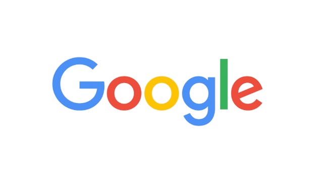
it’s really heinous. It has no balance, no flair, and it does nothing to tell you why you’re looking at it. It’s the polar opposite of good logo design, and that should tell you something: it’s not a logo. I mean it is, but instead of symbolizing a company or an idea or anything, it says exactly what Google is. It says, We’re so big and powerful we don’t need to say anything else about who we are. You’re going to use our services anyway. This logo is Google’s declaration to the world that they are the world’s biggest company and you don’t need to know anything else about who they are. You’re going to be touched by their services no matter what.
Only a company so massive and so necessary could come up with a wordmark (technically that’s the right term for it) that’s so goofy, that looks like it was done by a second-grader. Only a company with such unbounded confidence could convince you that you don’t need to know anything else about them just by looking at their name.
And to think that when I did that logo, the one that they so thoughtfully reinterpreted for the modern era… Google wasn’t even a word.
Be the first to comment on "FOOD FOR THOUGHT: When Google wasn’t even a word"