
A couple of weeks ago, as I was reviewing Windows 11, a longtime reader of this blog implied there was a double standard at work. I said the best thing about the Windows 11 update was that it was mild, and that no one really wanted a major visual change. People, I said, don’t poke around the settings panes. They just want to get to work.
And that’s when…
…it was pointed out that a lot of people said that about the visual update that DIRECTV’s Genies got a few years ago. And apparently there are some folks who think that the Genies should get another visual update because it’s been about three and a half years. So let’s talk about that a little bit.
Three generations of menus
Before about 2003, DIRECTV receivers were made by several different companies. Each had its own design for the user interface. But beginning back in ’03, DIRECTV took control. New receivers and DVRs had DIRECTV branding, not manufacturer branding, and they ran a standard user interface. It looked like some variation of this.
Clean, simple, with plenty of room on the outer edges for overscan, which was a big concern back then. I can’t help pointing out that this 15-year-old menu has transparent panes and rounded corners, just like Windows 11. Kind of makes you think.
In 2011, DIRECTV’s Genie arrived on the stage. It brought with it a new user interface that was migrated to the entire HD line. At the time it looked new and interesting, with a dark, dramatic theme.
The inset live picture was moved to the left to make room for decorative posters, while the overscan area was made smaller.
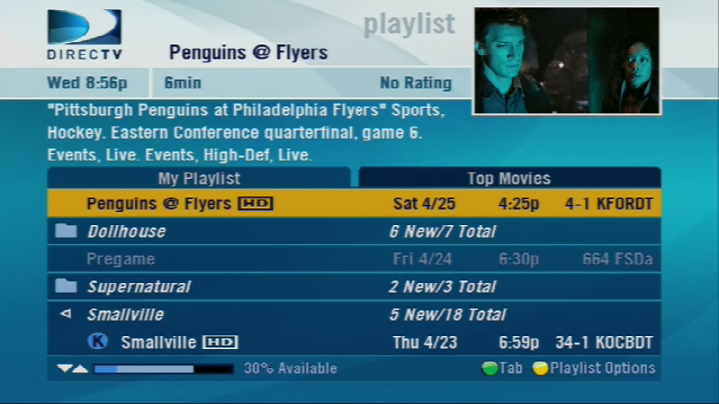
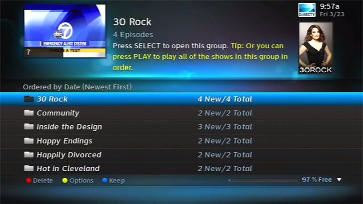
In late 2017, the current user interface was rolled out. It kept the dark theme but abandoned a lot of the extra shiny elements that had become so common in the last decade. After about six months of changes, it looked like this:
A sidebar was added to make better use of the space and much of the experience was rethought. But, this interface was unpopular among folks from the beginning. Some thought the user interface elements were too large, too “horsey.”
So is it time for a new look for DIRECTV?
Well I’ll give you the two arguments.
Yes, it is.
The current menus for DIRECTV are good, but they aren’t a one-size fits all. They really look best on a screen under 32 inches, and that’s just not the size that people buy. When you look at the menu elements on a 60″ screen everything seems too spaced out and too big.
More than that, it doesn’t seem contemporary. The 2018 update did a lot to make things seem fresh, but it was never a home run. And more importantly, the UI never seemed like it was really designed for usability. It was more like someone came up with a few photoshops of what looked cool in one specific case, and they built a menu around it.
Sometime in the next 12 months, AT&T will spin DIRECTV off into a new entity. AT&T will continue to own 70%, while TPG Capital will own 30% and eventually take operational control.
This is an opportunity to rethink everything about the company, including the way it looks when you turn the boxes on. People today have a lot of different screens and a lot of different devices. There’s a streaming box, there’s the TV’s menus themselves, plus the apps on their phone and tablets. People know what good, contemporary design looks like. They see it all the time. It’s time DIRECTV moved forward with the look and feel of their user interface.
No it isn’t.
Here’s a fact of user experience design that every designer knows. Whenever you redesign something, the first thing that happens is you lose customers. It’s universal. You hope it bounces back fast. If you’ve done your job, the new experience will be incredibly popular and your product will be successful beyond measure.
But the last thing that DIRECTV needs at a time when they are losing customers is to intentionally lose more. A lot of folks think they ought to focus on some other things that really need attention, like a new receiver for their commercial customers. I understand that sentiment, I do.
The truth is that the DIRECTV menus work. They could work better, but they work. And people use them. The DIRECTV demographic tends to be a little older-skewing, and that means they’re more likely to want things to stay where they are a little longer. I understand that sentiment too.
The DIRECTV user interface works fine for what you need it to do. It’s not time yet. Eventually it will make sense to roll out something new, but this isn’t the time today.
What do you think?
Folks, I’m the one who said that the user experience isn’t as important as the content. DIRECTV has great content. The user interface is also pretty good, even if it’s looking a little long in the tooth. It’s probably not the first thing you’d change about your beloved satellite service, but do you think that a fresh new look would help slow a subscriber decline?
Be the first to comment on "Is it time for a new user interface for DIRECTV?"