
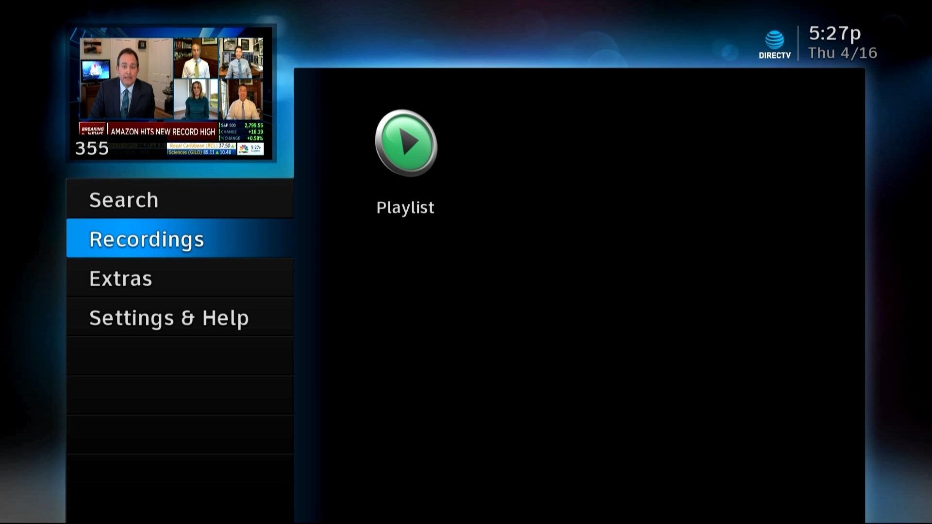
I have a theory, and I’m curious to see if you’ll help me prove it. Ever since the early days of DIRECTV DVRs, there have been two ways to get to the playlist. Here’s a screen capture from an H24 that’s connected to an HR24, to prove it.
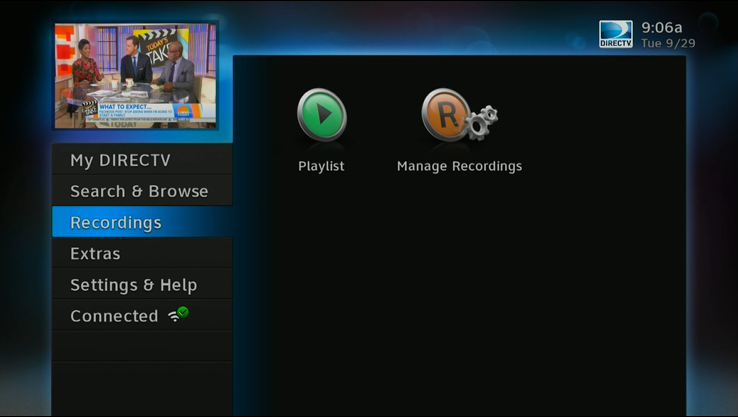
(Don’t believe it was always like this? Here’s a screen capture from about 2013 from a Genie DVR. Sorry it’s a little blurry, we’ve upgraded the tech since then.)
See, most folks, when they are going to their recordings, just press the LIST button on the remote. But there’s always been this other option. You could press MENU, go to Recordings, and then to Playlist. Which, to be really honest, I never thought anyone did. But hey, whatever, it gives the icon designers something to do.
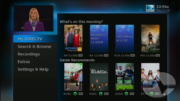
In the days after the 2017/2018 user interface refresh, things got even more interesting. Yes you could press LIST to get to the playlist, but you could also find the playlist by pressing MENU and scrolling down a bit. Here’s what it looks like now.
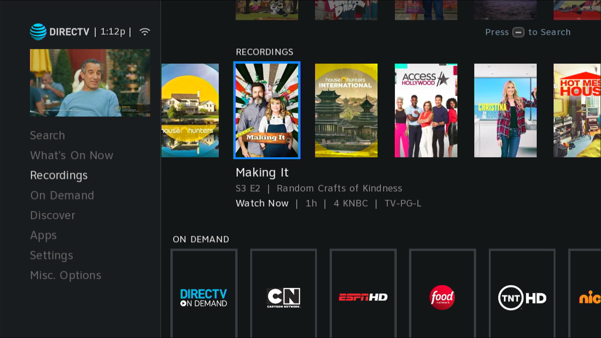
If you do it this way, you get nice big posters with lots of color and you still get a decent amount of information. You don’t get the recording date or the episode information, but it’s enough to know what you’re looking for.
But does anyone actually do this?
I know that the folks at AT&T know the answer to this. They track every button press, if you let them. By the way, you can opt out of that by going to directv.com if you want to. It’s your call. But whether they know it or not isn’t the point. The point is that whether or not they know it, they’re not telling me. And that kind of gets on my nerves, know what I mean?
Simpler is better, that’s what they told us right?
When the new user interface came out, they got rid of a lot of functions. One of the ones I still miss was called “Mark and Delete” where you could delete tons of stuff quickly. Now you have to delete every episode manually. Before they did that, they got rid of oh, about a dozen buttons on the remote including three of the four color buttons and the stop button. THE STOP BUTTON! Who gets rid of the stop button? But ok, they said, simpler is better. Let’s make the thing as streamlined as possible. I was just glad they didn’t strip everything back to the level of a Roku or AppleTV remote. And I’m glad for the customizable options you still have on the DIRECTV boxes.
But if simpler is better, why have two pathways that go to the same place? Why not tell people to press LIST to go to the list, and that’s that?
Here’s where you come in
If you’re interested in helping me stop bouncing off the ceiling, here’s your chance. Leave a comment below telling me if you use the LIST button, if you go through the menus, or if you’ll occasionally do one or the other. Let me know. Let me prove my hypothesis. Sure, this is going to be a skewed poll because this is a site for DIRECTV enthusiasts, not just regular folks. But hey, it’s something. Give me that much, will ya?

Be the first to comment on "SOUND OFF: How do you get to your recordings on DIRECTV?"