

It seems like we can’t get enough nostalgia on Fridays here at The Solid Signal Blog. We all remember the web being “so cool” when we first got on it, but the web’s own history betrays it.
Insider has put together a before-and-after of web sites as they used to look compared to how they looked in 2017 when the article was written. h Hate to tell you this… they’re not as cool as you remember. In fact, some of them are just a little embarrassing.
Real news
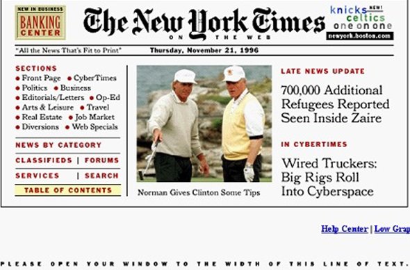
One of those that holds up fairly well is the New York Times site from 1996. Not surprisingly, its drawn-from-the-actual paper look is sincere, informative, and surprisingly content-rich considering that it was meant to be seen using a dial-up connection.
We were lucky enough to get an interview with a New York Times insider who was there when the page you see above (and the very first nyt.com page) went live. He said,
There were really no robust HTML production tools in the mid 90’s, and no ability to use custom fonts on web pages, so the New York Times producers built those pages using Quark Xpress templates and real fonts. They then saved them as EPS files and converted them to GIFs using one of the first “soft RIPs” Adobe developed. The producers then hand-coded links from the headlines to the full story. These image files were surprisingly compact; they downloaded fairly quickly even on 2400 bps dial-up connections.
How Times have changed!
Not like Solid Signal was any better
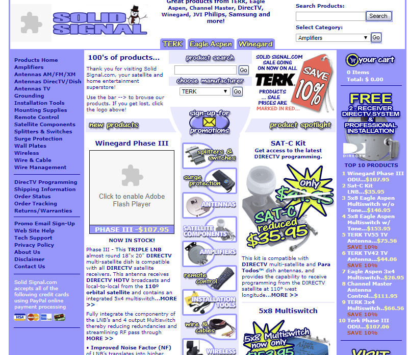
Yeah, back in 2002 we looked like that. I mean, the flash content worked, but otherwise it was just as unimpressive as it seems. Our site has grown up a lot since then of course.
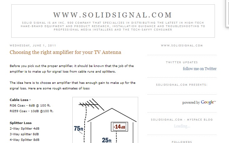
By 2007 The Solid Signal Blog looked like this, and I have to say, it’s pretty underwhelming. If you’re looking for a bit more history of this place, check out this article which was written for our relaunch last year.
But hey, all old web sites are embarrassing.
There isn’t one site that really got it right in the past. They’re all little time capsules of the design trends of their day and many of them are incredibly heinous. I remember writing some pretty awful HTML 20 years ago, using subpar tools like Microsoft FrontPage. That program should probably be outlawed.
Of course the first web page was even more embarrassing, even though it was incredibly inspirational since it was the first:
Because it’s so simple I was actually able to include the entire page in the quoted section, and the links are even live.
Sound off
What’s the site you used to be most proud of? Have you taken a look at it lately using archive.org? Maybe you should, and I bet you won’t be quite so impressed.


Be the first to comment on "Web surfing in the recent past"