

It’s something of a joke in the blog’s editorial room about how much I hate Hulu. I literally first started trolling them back in 2009. That was only a year after they launched. I recalled the incident in a later article, and in 2017 I yelled at them hard for a UI update that made them one of the worst apps around. Recently I’ve taken them to task for their bad HDR. In between, I’ve talked about what a bad value they’ve become. At one point they had content from practically every broadcast and cable source. That’s slowly been whittled down to where it’s basically very old content or content owned by the Disney company.
And now, they’ve decided to deal with their long-term user-interface issues by becoming… pretty much like everyone else.
The user interface blues
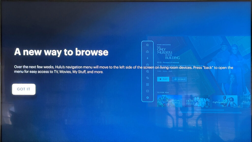
When this popped up on my TV yesterday, I snapped a quick pic. I apologize that it’s not up the normal standards of my screen captures.
If you look at the right side, it looks like Hulu is getting on the bandwagon that pretty much every other streaming app is on. Icons on the left, large auto-playing previews at the top, everything else is black.
There’s nothing wrong with that, and certainly a company like Hulu can be forgiven for co-opting a popular design trend. After all, their previous attempts at UI customization have landed with a thud.
The devil is in the details
As every app becomes more and more similar, the differences become more and more obvious. How many button presses does it take to get back to the home screen? Do the previews auto-play with audio? Do the tiles automatically expand if you stay on them too long? I personally don’t like auto-playing previews or auto-expanding tiles. But I’m just one person.
The one thing that’s clear is that Hulu’s design team has done very poorly in the past and if they’re looking at other apps to see what they’re doing right, that’s a step in the right direction.
It’s the content, stupid
The fact, though, is that Hulu seems to lead the streaming world in offering very little interesting content for an increasing amount of money. I, like others, was able to dodge the last price increase by bundling with Disney+. But, when the next 30% price increase comes, I’m not sure if I’ll stay around.
In fact, speaking of Disney, they seem to have fumbled this year as well. Andor was an excellent show that few people watched. The Mandalorian, originally the first Star Wars story with no tie to the original trilogy, has become rootbound with fan service. There’s barely one new character that doesn’t have a deep backstory from a show you didn’t watch or a comic you didn’t read.
When faced with lower viewership numbers and increasing complaints, Disney’s response has been the same as most other streamers. They’re cutting costs, canceling programs, and adding ads. Hulu was the original ad-supported streamer, and I think it’s held them back from becoming the kind of premium service they want to be.
Sooner or later, these executives need to understand that the real key to success in streaming (or any popular entertainment) is good content that people are willing to pay a fair price for. No amount of user interface improvements, no number of commercials, and no deep fan service will change that.
Look for my review
I’ll review Hulu’s new UI as soon as I see it in person. I promise to be as savage as I have been in the past. Maybe at some point they’ll learn.


Be the first to comment on "STREAMING SATURDAY: Hulu tries to fix itself again"