

Roku was the first streaming box, as far as I know. Back when Netflix was more or less the only streaming app, Roku and its soap-bar-shaped players were the only game in town. The company started as a spinoff of Netflix, back in 2008 when streaming to your TV was practically unheard of. For a few years, they had the market to themselves. Even when Apple waded in with a streaming device of their own, they still dominated.
And yet, you don’t really hear people talking about Roku much anymore. They’re sort of the “old reliable” of streaming devices. They’re cheap, but not as cheap as Amazon’s devices. Roku boxes are full-featured, but not as much as Apple’s devices. And they do support TVs as a built-in OS, but people seem more excited about Google TV these days.
What to do with a former “golden boy”
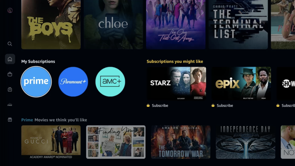
When you read articles about Roku, one thing that’s frequently mention is that the user experience seems outdated. Today, all streaming apps seem to feature a black screen with icons on the side and dynamically growing “posters” arranged by interest. There’s a big image at top, and above that there’s a category list. Prime Video’s latest upgrade is a great example of this.
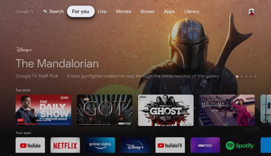
Google TV (formerly Android TV) has brought the same model to the overall user interface. It’s sort of becoming a de facto for practically everything in the 2020s.
I’m mostly ok with that interface, but I do get annoyed when things grow and shrink at unpredictable times. But that’s another article altogether. This one’s about Roku, whose user interface looks about the same as it did a decade ago, very un-2020s:
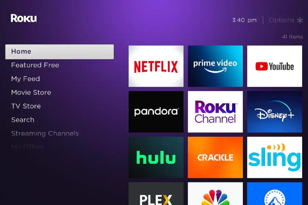
Now I have nothing against the purple. Purple is actually sort of an “in” color this year. But the overall look is starting to seem kind of dated, from the type selection to the big app icons with no opportunity to see what’s on. Some screens on Roku have ads on the right side which also seems like kind of a waste.
What should be done now?
The problem when you try to refresh something like the Roku UI is that you’re going to lose customers, guaranteed. Based on other trends and research, you’ll lose up to a third of your user base. Those are the folks who weren’t really happy but they were going to stay around because at least they knew what the buttons did. On the other hand if you continue to let things stagnate you won’t attract new people and that’s a problem too.
The right time for Roku to make a change would have been about five years ago, but let’s not cry over spilled milk.
I tend to agree with this article at TechHive, which even provides mockups of what the user interface could look like. But, the TechHive article really focuses on functionality and I think that something really needs to be done with the overall look. But it needs to be done carefully so as not to upset current users.
Here’s an idea… “both.”
I think Roku should go ahead with a redesign that takes current trends into account. Make the type smaller but thicker. Include suggested content on the home screen. Add a little pizazz. But then give the users the option to continue with the old home screen. It could be a preference you set in Roku’s massive settings screens. I think that would go a long way to keeping longtime users quiet.
I would still keep the purple, as well as the ability to use practically anything as a background if you want to. Roku has a lot of cute themes available and while I don’t tend to dive into them, they’re fun to look at.
Most of all I would just look at making better use of space. TVs are bigger now than they were a decade ago and a lot of empty space just isn’t needed. In keeping with today’s trends, the stuff on the left of the Roku screen could be reduced to icons when not being actively navigated. That would let apps and other content take up more space. Getting rid of the apps at the right and allowing more horizontal scrolling would also make better use of space.
“People don’t watch menus. People watch content.”
I was told that by a highly-placed executive about a decade ago. It’s worth pointing out that the person who told me that isn’t in the industry anymore. No, people don’t watch menus. But your menus have to work. They have to make sense and they have to seem modern and attractive. If not, your users just don’t see as much value in the experience.
Roku’s at a tipping point. Streaming on televisions is increasingly done through the TV itself. It seems like if you’re going to buy a streaming box, you’re probably going to buy an Amazon product because they are just so darn cheap. Roku’s made a name for itself in the middle of the pack, and if they want to stay there, they need to think hard how to do it.
I think the most most commonly used Roku device today is a Roku TV. The background is selectable, and can vary by the season. The basic icons and interface are the same, except there are some ads/promotions below the left hand menu. They are generally not top of the line TV’s, but good for their price. I like my two. My old Roku devices are in a box somewhere.