
When it comes to your favorite TV provider, some names are pretty obvious, some not. After all, millions of dollars are spent on product launches, which sort of begs the questions of how anyone could come up with names like “hulu.”
DIRECTV’s logo
DIRECTV plays on the term used in the 1990s for satellite TV, “Direct Broadcast Satellite.” Although practically no one uses the term DBS anymore, it is a fair description of the difference between modern satellite TV and the alternatives at the time. Back then, most of the satellite dishes belonged to cable companies, and those that did not belonged to hobbyists. Satellite service was really more narrowcasting than broadcasting, as it was accessible to only a few people.

DIRECTV logo in 1993
DIRECTV’s idea was to cut out the middleman (no one really likes middlemen) and bring you the same programming as the cable company, straight to your home. It really was “direct tv.” DIRECTV’s old logo is a clever mix of the letter D and a cyclone (the white part is what is supposed to look like a cyclone.) If you think it’s a little weird that a company would purposely compare themselves to a destructive force of nature, this was in the days before superstorms were common, and even when it was the official company logo DIRECTV didn’t use the term “cyclone” except internally.
For most of its history, DIRECTV continued to use that “cyclone” logo. This version is from the early ’10s when faux-3D design was all the rage. The cyclone went away during the AT&T days and was replaced by the AT&T “Death Star.” Since about 2010, the company has standardized on the DIN font, and it’s used even today. The current version of the logo has a break in the words that’s a subtle nod to the cyclone of the past.
DISH
The name DISH, though seemingly straightforward, is actually even more convoluted in its history. The company once known as DiSH Network used “dish” as both a backronym (an acronym built specifically to make a specific word, like Marvel’s SHIELD) and to indicate the dish antenna itself.
If you look at the DISH logo you’ll see that there really isn’t an “I”. The “I” is formed from the satellite dish beaming from space. DiSH originally stood for Digital Satellite Home, which was really just another way of saying Digital Broadcast Satellite. Like DIRECTV’s cyclone, DISH’s attempt at a clever acronym isn’t mentioned much anymore.

DISH logo in the 1990s
DISH also rebranded itself a few years ago, dropping “Network” and getting rid of the now-dated oval that seemed to take over graphic design in the mid-1990s. This move makes sense since they were never really a single network anyway.
DISH uses the same “beam” icon for Sling and Boost Mobile. They don’t make a big deal of it, but it’s a subtle way to keep a family resemblance between the differend parts of the empire.
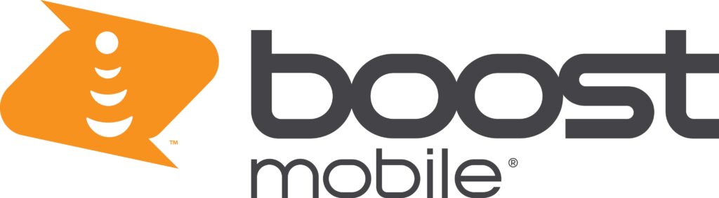
One thing I think is cool is that in Sling’s logo, the icon is sideways. That indicates that the information goes across the planet not into space. With Boost mobile, the icon is vertical but it’s inside another icon that sort of looks like two word bubbles that are connected. That’s a decent way of describing a cell phone conversation.
Just a reminder…
Signal Connect is a DIRECTV National Accounts Dealer. We’re also a DISH Premier Local Retailer. We’re here for you for DIRECTV Satellite and Internet. We’ll also help you with DISH, Sling, and Boost Mobile. Here’s a case where one call really does do it all. To explore your entertainment options, call us at [email protected]. You can also use the chat button at lower right, or fill out the form below.

Be the first to comment on "Where did they get the names “DIRECTV” and “DISH?”"