
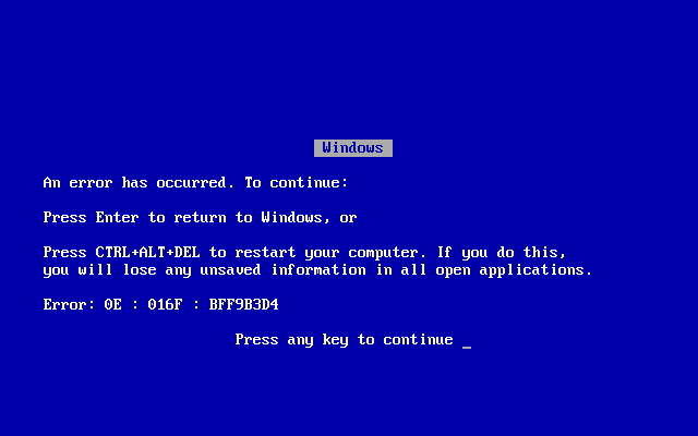
They call it the “blue screen of death.” It’s the last thing you see after your computer crashes, hard. But the blue screen isn’t just the last gasp of a dying computer. For example, when you boot a DIRECTV receiver, you get a blue screen with blocky text like this:
The blue screen certainly seems to indicate some sort of very basic form of communication. Why is that? In order to understand the blue screen, we need to understand two things: a little bit of computer history and a little bit of how our eyes work.
First, the science
We see color because we have three types of sensors in our eyes. One is sensitive to red, one to green, one to blue. Each one has evolved for a reason. Common sense would tell you that the red sensor evolved to help us identify danger. The green one helps us identify safe things, like leaves. And the blue one helps us see more of the world around us in a more general way.
Because our eyes work this way, our monitors and screens work the same way. Look closely at any screen and you’ll see individual red, green, and blue lights.

The intensity of each of these lights helps create any one of the millions of colors that we can see. In modern monitors, each of the three lights can be lit up at least 255 different brightness levels. But let’s say you needed some very simple ways to communicate. You could reduce your selections down to 8 choices, and this is how they would work:
| RED | GREEN | BLUE | |
|---|---|---|---|
| BLACK | OFF | OFF | OFF |
| RED | ON | OFF | OFF |
| YELLOW | ON | ON | OFF |
| GREEN | OFF | ON | OFF |
| LIGHT BLUE | OFF | ON | ON |
| PINK | ON | OFF | ON |
| BLUE | OFF | OFF | ON |
| WHITE | ON | ON | ON |
This would be a very simple way of presenting colors, so simple that even a computer from the 1970s could do it. And that’s what I’m getting at.
Early computers had limited graphics
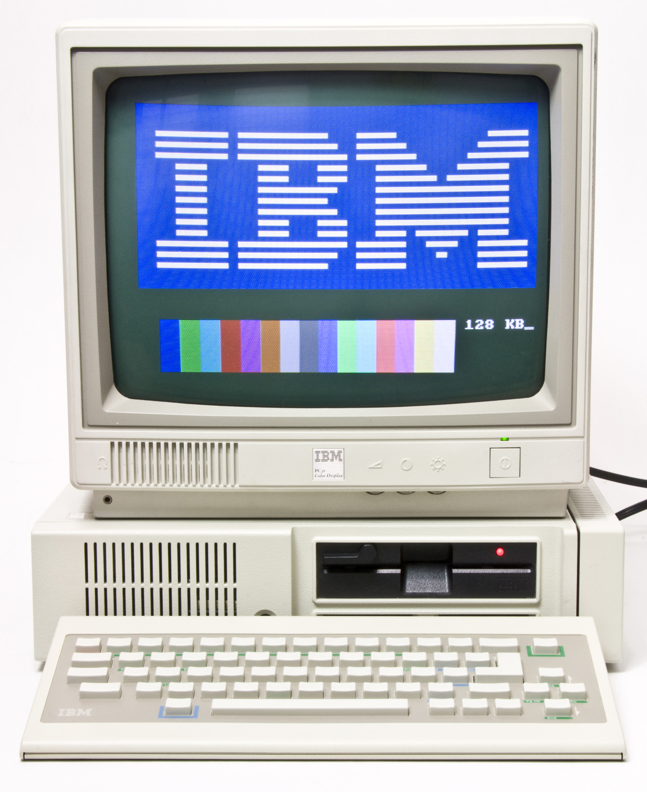
When you talk about the computers of the 1970s and 1980s, you see very limited graphics capabilities. The ability to display color actually comes in pretty early, around 1979 with the Atari 800 and similar devices. Those computers used consumer televisions. White text on black had a tendency to look blurry, and so they turned to white text on blue which was legible and also very simple to do. White text on red or green would not have been as legible.

This convention continued for decades. When early IBM PCs developed color graphics, they also continued the white-on-blue motif which was easy to display and looked good on the low-quality monitors of the day.
Really it was sort of inertia after that
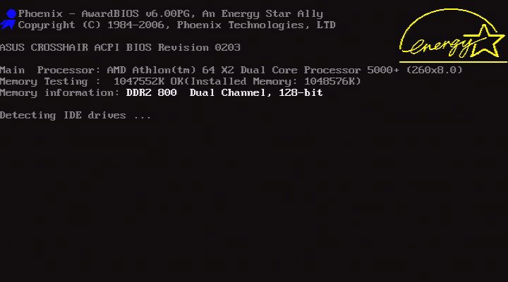
By the 1990s color monitors had no problem showing white on black, or showing more than 8 colors. But the idea was that if you were doing something like a boot screen or error screen, you were still going to present the simplest possible screen. You just wanted the user to be able to see what was going on. You didn’t care if it was pretty.
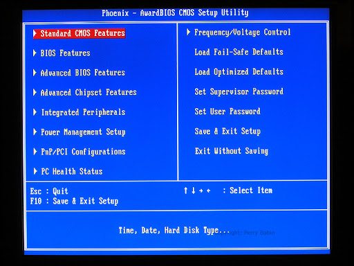
By and large, computer boot screens went to white on black:
While more critical or informative screens stayed white on blue:
And of course, the ubiquitous “blue screen of death” stayed white on blue, as shown at the top of this article.
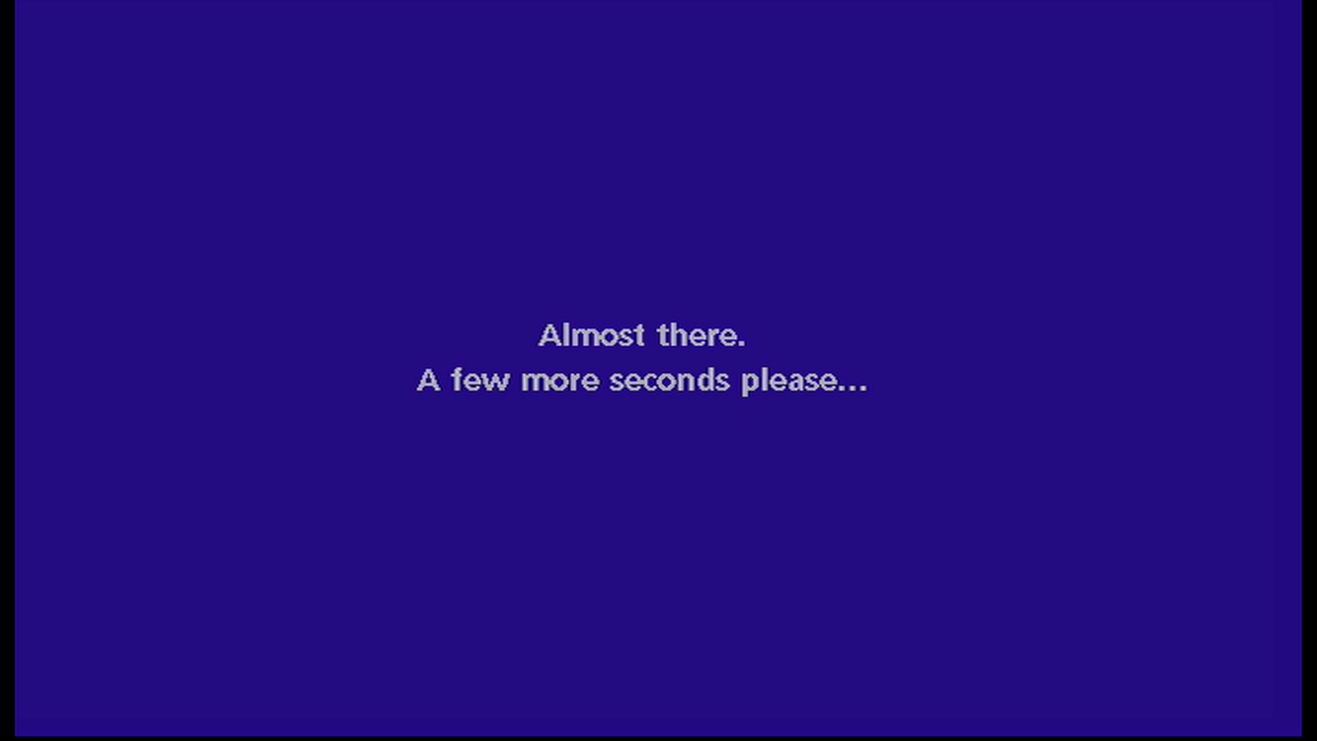
In later years
Windows 10 is without a doubt the most stable version of Windows, but it’s not immune to serious problems. Windows is advanced enough to display pretty much any graphic content you want even when it’s in serious distress. But, the standard had been set and so designers created this slightly more attractive version:
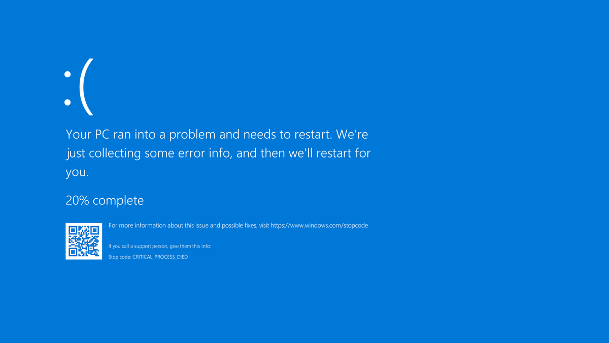
It could have been any color or looked like anything. But hey, there was a precedent.


Be the first to comment on "Why are computer error screens blue?"