

I know it’s an incredibly geeky thing. But I actually get kind of nostalgic when I see older user interfaces. There’s something incredibly cool, I think, about the Windows 3.0/3.1 interface. This is the one I’m talking about:

Keep in mind that the designers of this UI had only 640×480 to work with. That’s less resolution than there is in a single icon on your phone. Yet, they not only managed to convey all the information you needed, they even gave a 3D effect to the buttons. For someone who didn’t know what was clickable and what wasn’t, this was incredibly important.
By the mid-2000s we start to see icons becoming really important designs. The first icons for Macintosh are still works of art, because they’re so clear with so little data. But they don’t really reach the design level that you see in corporate logos. I’d argue that the first icon to do that was this one:
This was one of the original icons for Microsoft Internet Explorer. It comes from 1996 and it’s so well executed that it still reads well today. It’s an E for explorer, with something orbiting the world. Even if you didn’t know it was internet software you might be able to guess. That’s the mark of a good logo. In later years, it would suffer from an excess of 2010s special effects, looking like this by the time Windows Vista came a decade later:

Still it retained enough visual identity that all that extra shine didn’t hurt it. The logo remained until the end of Internet Explorer’s life, when it was replaced by the first generation of the Edge logo, which deliberately calls back to the original Internet Explorer logo:
Arguably it’s not as good of a design, but the first generation of Edge wasn’t that good either.
I’m not the only person who thinks this way
I ran across this essay on howtogeek, which traces the history of web browsers using their familiar icons. You can see how visual design went from extremely simple, driven by the limits of technology, to unnecessarily shiny and 3D, back to mostly simple. And now, where we are with icon design is that there’s a lot of very subtle depth to the icons you use every day, but it doesn’t register. Instead you just get an impression of overall quality. That’s the sign of a well-crafted logo or icon. You shouldn’t need to break it down in order to understand what it’s all about.
A few that were left behind
I find it interesting that there are two logos from the early days that were not represented. The first is the original NCSA Mosaic logo.

What you see here is one of the very first web browser icons. It sorts of hits you in the head with what it does. It takes you all over the world from point to point. It’s not a great logo. At the time it was created, colors were very limited and resolution was low. but that’s not really the issue. The issue is that it’s a little too on-the-nose and it looks like an “S” which doesn’t really have anything to do with the internet.

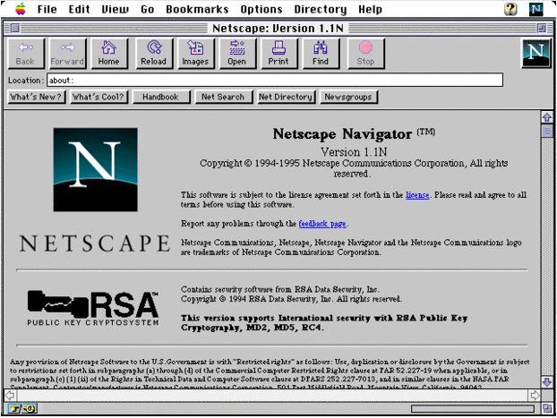
I’d argue that this logo should have been included, though. It’s from Netscape, the first browser most people used in the 1990s. Netscape was a retail version of Mosaic and it was the first entry people got into the internet if they tried it before Microsoft’s utter takeover of the browser market. It’s also a very decent logo. There’s a subtle curve indicating the world, and the lower part of the “N” is hidden giving some dimension. It’s a good thing this was a good logo too, because at dialup speeds, you ended up looking at it a lot. As you can see from this screenshot, it sat at the upper right of the window and animated as you waited for your data to arrive.
The timeless logos of 2023
Are there any? Will we look fondly back at the oddly balanced “F” of Facebook or the recently introduced “cheese slicer X” of the former Twitter? Time alone will tell, but I rather doubt it.
Be the first to comment on "FUN FRIDAY: A history of browser icons"