

VHS tapes were once the highest of high technology. Think about it. If you grew up in the 1960s or 1970s (or earlier), you were a slave to your TV. If you missed something, your only choice was to catch it in reruns. Television was uniting the country, and your only choice was to sit there and watch it in real time. That is, until the VCR was born.
Videocassette recorders were introduced in the 1970s but weren’t priced for the consumer market really. They were luxury items. The recorders were priced at about $1,500 (about $10,000 in today’s dollars, depending on who you ask) while blank tapes were $20 each, which equates to maybe $160 each today.
By the 1980s, though, VCRs were on their way to becoming commodities. It was possible to get a decent one for $250. Still pricey but about what you’d pay for a premium phone today. Tapes could be had for about $5, and that wasn’t too bad since they could be reused.
The blank VHS tape was just expensive enough that you wanted to keep them nice and clean, just cheap enough that you could afford them. And this led to some of the nicest commercial art of the decade.
The VHS sleeve
Typical VHS tapes came in paper sleeves that gave a decent amount of protection. They featured contemporary-looking designs which popped off the shelf. Here’s another one, a little classier but still eye-catching:

Back then, and I’m not sure why, I was a bit of a snob, preferring the TDK Super Avilyn brand.
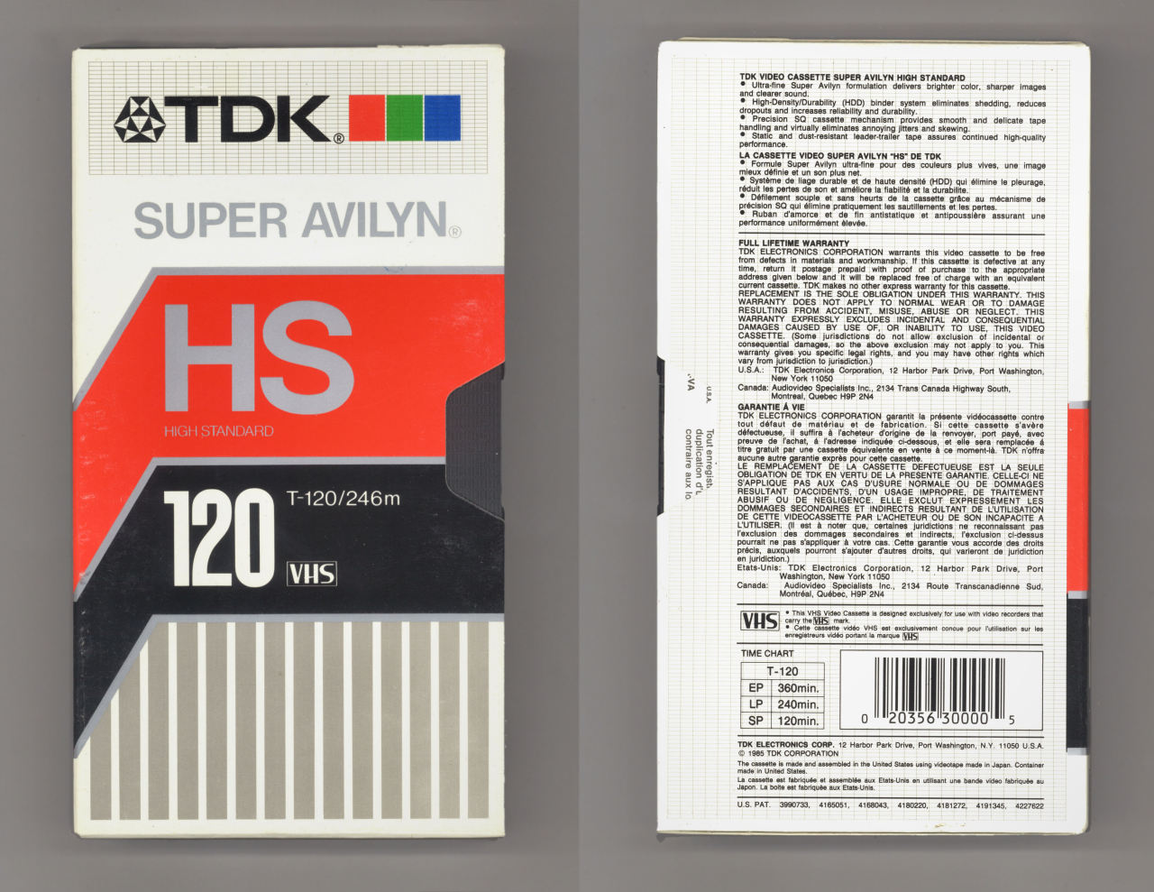
Now, I’m not sure what an “Avilyn” was, and I don’t think I knew back then. But there was something about this particular tape that shouted, “Hey Stuart, buy me.” And I did.
Someone else geeked out about this more than me
Hey, that’s saying a lot right? I mean, I geek out about some really obscure stuff. But YouTuber 4096 took it to a different level. They not only recreated a lot of this art but then animated it. Take a look:
The designs are really quite faithful to the originals. It helps of course that the 1980s was a time for flat design and only about ten fonts, but still the amount of work is impressive. Most covers are reproduced really faithfully, although for some reason some manufacturer names were changed. For some reason the first image is of an “APHEX” videocassette which clearly should have been “AMPEX.”

Yes I know this is a beta tape, it’s the image I could find.
I really have to give credit to this person for the time they spent. They really brought this artwork to life and a lot of it looks contemporary even today.


If I ever get around to cleaning out my storage space, I know I will find boxes and boxes of forgotten VHS tapes. A lot of them will be that TDK that you referenced. I don’t remember the specifics, but I had a heirarchy at the time. There were my “every day” tapes, and then there were “nice” ones that were reserved for “important” tapings that I intended to archive. Of course, they’re probably all deteriorated at this point.
Awe the good ole days……..I remember where I grew up an Ace like hardware store had tapes on sale for 99¢, I bought a whole case of them, I don’t remember how many were in a case though. I also had 5 VCR’s at one time recording different shows at once with a tape or two for each day of the week. Good times.
I still have some VHS tapes around here somewhere.