

Back in 2014, I found myself bored and having trouble picking article content for this blog. Hey, when you’ve authored over 9,000 articles it’s bound to happen. For some bizarre reason I settled on writing about the icons on the phone and how they don’t make a lot of sense. I really focused on the microphone icon and how you wouldn’t know it was a microphone.
It’s true: would you know what this is:
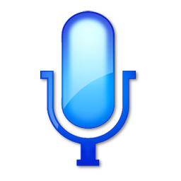
if you’d never seen this?

And really, that bottom one doesn’t exactly shout “microphone” if you’ve never seen one, either.
In the four years since I wrote that article I’ve found myself thinking about it more and more, and wondering if I did the topic justice. I probably could write a 10,000 word essay or do a 20 minute video about the subject, but that would be wildly off topic for this blog anyway.
Still, since 2014 things have just gotten more confusing. More people have grown up rarely-if-ever sending a “real letter” or using a real microphone or camera that’s not part of a phone. iOS users may look at a compass while launching a browser, but have they ever seen one in real life? Android users may tap on a globe but do they even know we used to call it the “world wide web?”
And then of course there is gender. Not really the subject of this blog, so let’s just say that the way we understand and define gender has changed massively just since 2003. I’ll leave it at that.
Icons don’t help
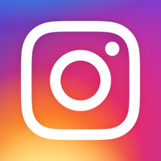
A few months ago I pointed out that icons on phones are actually getting harder to understand. The icon for Instragram used to tell you that it was a social network based around pictures:
![]()
and now it sort of does but you kind of have to know that’s what they were shooting for:
See, even though we like to think that icons, signage and pictures have some sort of universal appeal, they don’t. They don’t require that you know the language, but they’re just as specific as any single-language sign. Want proof?
Which of these is easier to understand?

Of course you know what that sign means. It says so in English. But if you’re not an English speaker it might seem confusing to you. That’s why in Europe, all the stop signs look like this:
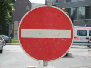
OK, so you don’t need to know any language at all to understand that. But if you just stumbled out of the woods would you know what it means? It’s red, it has a bar. That might mean something to some people raised in Europe, but to me it looks like a sign that says round robots are not allowed. Sorry, BB-8.
Maybe in another 4 years…
I might just do another Throwback article and laugh about how this whole icon mess has been resolved. Don’t count on it. I’m sure it will be 10 times worse.

Having driven in Europe, I can attest that the stop sign we use here in the US is also used in Europe.
The round red sign with the white bar is the international “Do Not Enter”.
Having driven in Europe, I can attest that the stop sign we use here in the US is also used in Europe.
The round red sign with the white bar is the international “Do Not Enter”.