

Because, apparently, we are not divided enough. Recently I’ve been hit on several sides by this question:
How many spaces should you put after a period? One or two?
Seriously folks, this is what it’s come to? I’ve been asked on private forums. There is essay after essay about this, and it seems to largely boil down to a generational battle. Boomers who learned to type on typewriters want two spaces after a period. Younger folks say one period.
Here’s the official answer
At least it’s my official answer. If you are using a monospaced font, use two spaces. If it’s a proportional font, use one. Here’s an example.
This is a monospaced font. You use two spaces here because all the letters are the same width.
This is a proportional font. You use one space here because the letters are different widths.
Folks, that’s all there is to it.
Here’s why that’s all there is to it.
You need the extra space when all the letters are the same width because you need to show the gap between sentences in a really obvious way. If you learned how to type on a typewriter, you learned the double space method. You learned it because virtually every typewriter in every school, ever uses a font where all the letters are the same width. There’s a gear in a typewriter that moves the carriage a fixed amount every time you type. That’s why the letters are the same width. If they weren’t there would be really weird gaps. So instead of weird gaps we get a lot of extra designey stuff on the “i” and the “l” and other narrow letters.
This isn’t a new phenomenon.
I started setting type a long, long time ago. By setting type I mean using a machine that was specifically designed to put out high-quality type for commercial printing. I also did a fair amount of “real” typesetting. I mean picking letters up out of bins and lining them up by hand. You know, this:
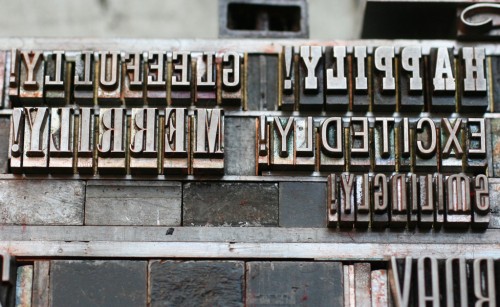
In really traditional typesetting, all the spaces are different sizes, not just the ones after periods. It doesn’t make sense to physically pick up two spaces to put them after a period. That’s just not how that stuff used to work.
Does it really matter?
Even though I’m pretty firm about what the rules ought to be, I won’t hold you to task if you use two spaces after a period. If that’s the way your fingers work, then so be it. I’ll still be able to read what you write if you put that extra space in there.
The moral of the story is that in one way or another we’re all sort of beholden to the old technology standards of the past. We watch widescreen TVs now because in the 1950s moviemakers wanted something different from the square screens of TVs of that time. So they invented widescreen movies that didn’t look right on TVs. So, then, they invented TVs that the movies looked good on.
The point is actually a pretty important one. If you make a user experience that people can use easily, one that leverages their existing knowledge, you’ll succeed and you’ll slowly be able to train them to whatever you want to do. This is what cell phone makers have done. If you try to make people take steps they’re not ready for, they sometimes rebel.
So I say to you, use your equipment your way! That’s the whole point of shopping at Solid Signal, and the whole point of getting through the world of modern technology.


Sorry, I disagree, one space no matter what! I do NOT like to have to reduce every PPG by replacing ” .” with ” .” It has always been one space on typewriters which were in use before computers why are we trying to change things now? Is it so difficult to see the “.” period at the end of a sentence?