
You’ve probably noticed that DIRECTV Satellite has really upped their “screen saver” game in the last year or so. I’m not convinced that it’s the most important thing in the world, but it’s just part of the overall upgrades we’ve seen since the company spun off from AT&T. There’s a lot more coming, at least we all hope so.
You might remember that for about 20 years, the only screen saver on DIRECTV was a bouncing logo. Because YouTube has everything, I can even show it to you.
You have to remember that prior to the 2010s, there was a real danger of burn-in on televisions. If you don’t remember burn-in, it happened when you had something paused too long, and a ghostly image would then remain on the screen afterwards. Unfortunately, once it happened, it was too late. It was usually irreversible. I know of plenty of people who bought $20,000 TVs back in the 2000s and had to toss them just a few years later because of it.
To help avoid burn-in, DIRECTV put in a screen saver that kicked in when you paused for more than a minute or two. The bouncing logo seemed like a real kick in 2005 but let’s be honest, we always knew there could be more than that.
Screen savers today
DIRECTV now uses its screen savers to promote its programming and services. They’re full of video and motion and are vastly improved from the old bouncing logo. You still get them when you pause, of course. The difference is that TVs today don’t really need screen savers. That means DIRECTV is free to do whatever they want. And what they want… might be to spoil a future update. Here’s what I’m talking about
Observed in a recent screen saver…
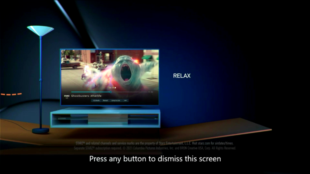
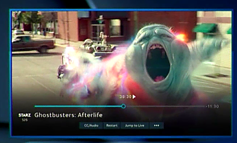
This is a video capture of a recent screensaver. It advertises DIRECTV’s mover’s connection. Like most the stuff you see, it’s heavy on the CGI. Also I’m not sure anyone still uses those torch lamps anymore. I got rid of mine in 1997. I don’t know, maybe they’re coming back. But hey, I’m getting off topic. Take a closer look at the simulated TV screen. Here, I’ll blow it up for you and add a little sharpening.
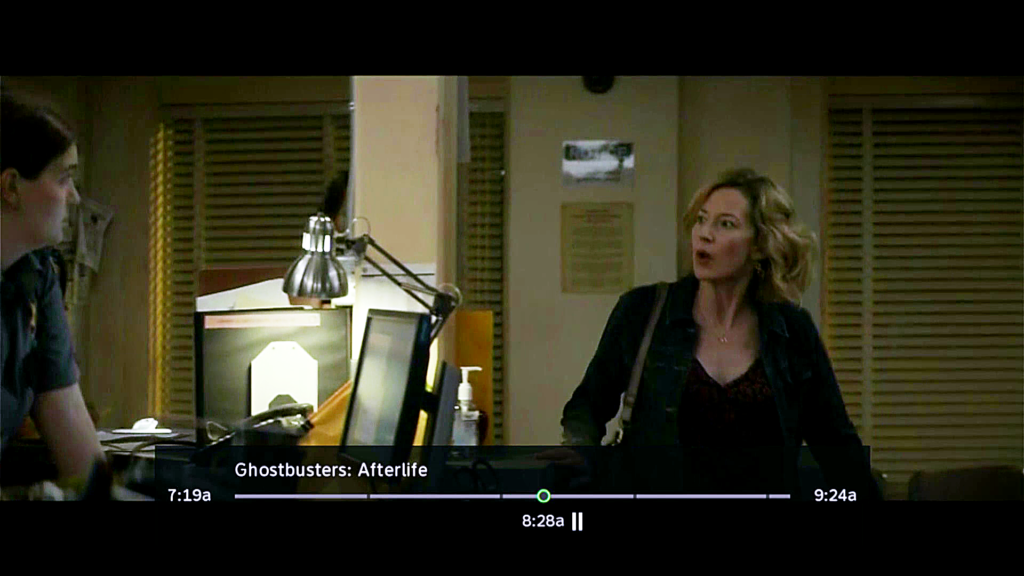
That doesn’t look like a normal DIRECTV “pause” screen! It’s close, but not the same. Here’s the actual pause screen:
The CGI image has a faded black background, the channel logo, and four options at the bottom. They seem to be CC/Audio, Restart, Jump to Live, and […]. The progress bar is also blue rather than green or orange as is seen now.
Is this a sign of things to come?
I’ll say right now it could be, but it’s probably a long way out. There’s one clear tell that this is a mockup and not just a screen grab. If you look at the time indicators, it says you’re 29:30 in and have 11:30 left. That would imply a 41-minute movie. The actual run time for Ghostbusters: Afterlife is two hours, four minutes. So this is made up for sure.
There probably should be some improvement to the user experience at some point, but I’m not sure it will look like this. I’m guessing this is some designer’s idea of what it should look like.
The faded background has been tried before. Take a look at this screen cap I did back in 2012:
This was the first version of DIRECTV’s high definition user interface. The whole bottom was dark, fading into transparency. That’s much like the mockup you see above. People flat out hated it. It became impossible to see things like sports scores and news tickers when paused. It took a few months and DIRECTV changed the design to what we see today.
I like the idea of the channel logos and of there being more options, but what I’m seeing in that mockup is a big waste of space. I already think a lot of the elements on DIRECTV screens are too big. They are scaled for 27-32″ TVs and most folks have TVs that are much larger than that.
Sound off
I know there are a lot of folks over in DIRECTV’s El Segundo, CA headquarters who read this blog. If they are considering a change to the user experience, they’ll do their own research, sure. But they’ll also read blogs like this to see what users like and don’t like. So let’s get those comments going and tell them what we think of this mockup. Who knows, it could be for real.

Thats the Directv Stream Interface