
It was a year or so ago that Microsoft released the latest (and what they are calling the last) version of their operating system. Windows 10 was intended to heal the wounds caused by its predecessor Windows 8, and it did so by pretty much turning its back on everything Windows 8 stood for. Gone were apps that filled the screen no matter how big the screen was. Gone was a full-screen Start menu that pulled you out of the computing experience. A lot of menus that still retained the old Windows 7 style were revamped, and the new updated added voice control and a host of other new features.
At its heart, Windows 10 was really a fairly incremental update to Windows 8, and that was ok because the underpinnings of Windows 8 weren’t the problem. It was the way you worked with the thing, and users by and large hated the way you worked with Windows 8.
Windows 10 was honed by a cadre of testers who installed pre-release builds to test for bugs, and the result was an operating system that seemed remarkably stable even on day one. The fact that it could use older drivers without a lot of trouble certainly helped.
What helped most of all is that Microsoft made Windows 10 totally free for almost every existing Windows user. It was a good PR move and you could argue that it didn’t cost a whole lot because OS upgrades haven’t been a big source of revenue for a long time.
Happy Anniversary
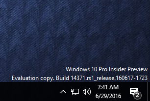
If rumors are to be believed, you’ll see the next iteration of Windows 10 within just a few weeks, with the rumored “Anniversary Update.” There is a lot in the background and you’ll hear tech types talking about “Windows Ink” and “Edge Extensions” but the truth is you don’t care about that. I’ll show you what you do care about. These screen captures come from the latest beta of the operating system and could change, but aren’t likely to.
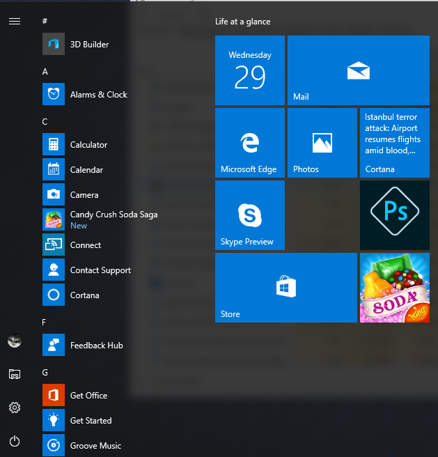
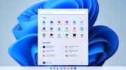
Yes, they monkeyed around with the Start menu again. Will they never learn? People just get used to things being one way and they change them again. The good news is that they didn’t change much. The list of apps shows up at left instead of your most recently used apps, which you could easily pin to the right side anyway. The area for changing settings or going to file explorer is smaller, which is ok since most folks don’t use that. But still, I think it was a mistake to make a big change like that so quickly.
It seems a little passive-aggressive but Microsoft REALLY wants you to use the action center. That’s that menu that pops up when you click on the little “speech bubble” in the task bar. Most people ignore it, for the most part I only look at it to clean it out now and again. But Microsoft REALLY wants you to use it, they think it’s super awesome.
To make sure it’s as jarring a thing as possible and that you’ll click on it as often as you can, they moved the speech bubble to the right of the clock. I do like that there’s a number showing you how many notifications you have, but I think moving the clock out of the lower right is a big, big mistake.
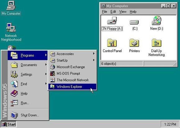
As you can see, the clock has been in the lower right corner since the days of Windows95. If the clock were a person, it would be old enough to drink by now. Even Windows 8’s desktop mode had the clock in the right place. Monkeying with that seems like a totally unnecessary move and I hope someone comes up with a plugin that fixes that, or that Microsoft abandons this idea.
Look, the action center makes sense. It does. It’s a good place to see what’s going on with a lot of things in your computer. But it’s not the reason I log in. The reason I log in is to get stuff done, and when I’m doing that, I look at the clock from time to time to see how much more I can get done. I’ve been looking in the same spot since I ran Windows on a 486 with a 14″ monitor. I mean, really I’ll get used to it but seriously…
Microsoft seems to have this bad habit of messing up Windows with rouhly every other release. Windows 95 good, Windows 98 good, Windows Me bad, Windows XP good, Windows Vista bad, Windows 7 good, Windows 8 bad, you see where I’m going with this. I don’t know why the braniacs over there can’t just leave something iconic like the clock position alone. Maybe I’ll be the only one who complains about this, but seriously this was a totally unnecessary move and at the very least I can’t imagine anyone seriously being overjoyed about it.
I would have rather seen some other changes to the system, not that it’s bad as is but it would be great to improve start times even more and make it even more friendly to SSD-based computers. Create a better experience for HiDPI screens, right now it’s sort of half-and-half if you want to use larger icons on a 4K monitor.
This new update should come out in the next few weeks. I’ve heard a date of August 2. When it does come out, it will be like the “November Update,” it should hijack your computer for about 20 minutes but after that everything should just work.
So what do you all think? I’m curious, who else is trying the new operating system already and how does it work for you?


Be the first to comment on "Windows 10 after 1 year… what do you think?"