
One thing is for sure, the more you talk about color, the more confused you will get. Color is not a real thing. It doesn’t exist at all unless someone is there to see it. (That’s the answer to the question… if a tree falls in the forest and no one is there to see it, is it still brown? No.) Color is “an observed phenomenon.” It’s very possible that no one even has the same color perception…although we all agree that such-and-such is “red”, there’s no saying that if you could really see through someone else’s eyes that it would even be “red” by your perception.
What a mess
In short, color is a big mess. And, no one knows what color the mess is. (Thanks for asking.)
Oh, there are scientific things about color that we can study. We know that if you shine a light that is precisely “this” color at “that” thing, you’ll get a predictable result, and most people will call that “red.” More importantly it is a consistently measurable wavelength of light, and so there’s no worrying about different people’s opinion.
Around now you’re getting sorry that you clicked through, aren’t you?
Color becomes important when you’re talking about HDTV because you can actually do something about it. You can change the tint, you can change the intensity, the brightness, and the contrast. These controls have existed since TVs went to color, and so have the tools that let us as professionals make sure that every TV is displaying color the same way.
Color on your TV
If you’re looking at the controls on your TV, here’s a basic description of what the controls do. This is simplified somewhat so that it makes sense to the non-scientist, of course.
Brightness controls how close to pure white the lightest thing in the image is. On LCD TVs there is also a setting called Backlight which, confusingly, changes how bright the actual light source is, which has pretty much the same effect. The picture can only get so bright, so if you turn the brightness up beyond that, other stuff gets white that shouldn’t get white. We call this “washed out.”
Contrast controls how close to pure black the darkest thing in the image is. Every TV has a “contrast ratio” meaning that it’s possible that if you make the dark things very dark, you’ll end up darkening the light things too.
Tint which is more accurately called “hue” specifically shifts things to the left or right on the rainbow, so that something green (which is in the middle of the rainbow) can get redder or bluer. This is something most folks don’t touch unless the TV is really messed up or they want people to look like aliens.
Color which is more accurately called “saturation” controls how much grey is in the image. If you take out all the color, there is nothing but black-and-white. Take out all the grey and everything looks like it’s “burning out.”
Now we have to talk about gamut
There’s one thing you can’t change is gamut and it’s the real reason that HD looks so much better than SD. If you’ve ever thought that dark things “just look darker” in HD, you’re right. Gamut is essentially a map of what colors can be produced by what device. See, not every device can show every color. Ink-jet printers never get that neon-green or robins-egg blue you see on the screen and the reason is, it’s not in their gamut. They physically just can’t do it. On the other hand, inkjet printers can print things that are much, much darker than your monitor. The dark colors are “out of gamut” for your monitor.
SD programming has a color gamut that lets most colors come through, but it doesn’t do so well with dark colors. This is because the early picture tubes in both cameras and TVs just couldn’t display those colors. Even though later TVs (in the 80s and 90s) could show those colors, the industry decided not to even try, so that all TVs looked closer to each other.
HD programming does have a “wider gamut” meaning that it’s not your imagination, an HD picture will actually show more colors, both bright and dark, than an SD picture.
By the way, your cell phone has a different gamut than your TV, that’s why pictures look differently when you take them compared to when you show them to a crowd using AirPlay or some other technology.
This is very hard to show, and when you try to find images that show it, you end up with charts like this one:

The chart tries to show you all the possible colors. Of course this is impossible. It then shows you a triangle, like the one above. That triangle gives you an idea how many of those colors a particular device can show. Color gamut is actually different for every TV. That’s right, every TV, every single one is a little different. So, there are standards that the TVs try to match. But, that’s the subject for another article.
Gamut and dynamic range
It’s become much more fashionable to talk about dynamic range lately. Dynamic range is, at least for my money, the simpler and less frumpy cousin of gamut. It’s specifically the difference between the brightest color your TV can show and its darkest. There’s no consideration for actual color, just brightness. Dynamic range, more than anything, contributes to the perception that your TV “looks better,” except when it doesn’t.
The latest crop of TVs are labeled high dynamic range (HDR). HDR means that the can show shades that are brighter and simultaneously darker than a typical HDTV can show. This should make everything look more realistic. It does except for one thing that we seem to have forgotten: reality isn’t that good-looking. A lot of shows that are recorded in HDR end up looking darker or muddier than those recorded without it. They more closely match reality, rather than the fake, well-lit experience you’re used to. That has the effect of making people less interested in what they’re seeing.
Still glad you clicked through, or does your head hurt?
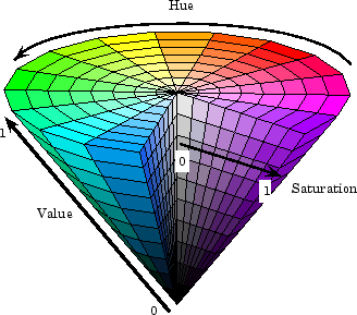
The best you can hope for is to try to understand color “just enough.” Hopefully, that way that you can enjoy the television watching experience. Also hopefully, you won’t get sucked down the pretty diagram that is the bottomless pit of color theory:
You’ll find plenty of other articles about this sort of thing if you look. But my suggestion is, stop, take all this in, and browse SolidSignal.com. It’s a much more calming experience than trying to understand color.
Be the first to comment on "What is color?"