
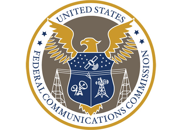
Yeah, look at the top of this article. What you see above you is the new seal for the FCC. Apparently they made this change in April of 2020, when we were all paying attention to something else. Hey, when you think about it there have been a few other pressing things on our plates.
The old logo
The new logo is technically a “seal” while this remains the official “logo” of the FCC:
It has a charming, almost retro, look to it. It doesn’t really mean anything, but you know it’s the FCC because, it says FCC. And really that’s about what you need to know. The FCC logo adorns any FCC-approved device that hasn’t specifically applied to hide its compliance labels (as they now do on phones.) It has to be pretty recognizable at a small size, and this is.
The FCC had an old seal, too. It looked like this:

And it’s fair to say there wasn’t a lot to like there. I certainly understand how a redesign was merited.
How the new seal came about
Once upon a time, you hired a brand strategist or graphic designer to create a whole new identity. That’s how we got memorable logos that lasted decades, like those for AT&T, DIRECTV, DISH, and other tech companies. In the last few years, it’s become popular to put these things out to your employees in a contest, and have everyone vote on what they like. Why not, say big companies, since there are so many documented cases of “the little guy” creating a simple logo that rivals those that big ad agencies charge millions for.
Surprisingly, though, this seal was designed by Umasankar Arumugam, whose Linkedin identifies him as a real brand designer. The final version was voted on, though, and that means that a lot of people used their personal preferences instead of good solid branding ideas.
Before I get any further I want to say to Umasankar Arumugam that I understand where you are coming from and please don’t take the rest of this article personally. I totally understand how it is working with large organizations and confidentially, I’d love to see some of the other things you submitted that were probably better. I also know that whatever you designed had to fit with other Executive Branch logos, such as this one from the Department of Homeland Security:
![]()
That can be a real challenge for someone wanting to be creative.
And now the scathing part
I was completely ready to write an article saying that this logo is a perfect example of why you don’t let amateurs design things. And then I learned that a professional designed it.
There is absolutely nothing subtle about this logo at all. Every line is the same weight, every icon has been reduced to the level of simple clip art. Everything has been mashed down to a flat perspective.
The seal shows four of the FCC’s primary areas of influence – wired communications, cellular, terrestrial long-distance, and satellite. Its collection of stars apparently has historical significance. And of course there are the three things that it seems every Executive Branch seal needs: An eagle, a shield, and some sort of classic-looking serif font. Although, it’s worth pointing out that every department uses a different font. So much for consistency.
The real issue with this new seal is what’s right under the surface. A good logo will make sense on several levels. There’s a lot to talk about below the surface here, too.
Allow me to explain
The central image is, of course, the eagle. The eagle is similar to that on other seals, but it’s also different. The talons are hiding, or perhaps missing. The implication here is that the FCC has no claws, they’re ineffective.
Looking at the wings of the eagle, the lower feathers are separate from the upper ones, which may imply that they signify broadcasting. If so, they’re covered up and diminished by the white outer circle. Shouldn’t this seal be emphasizing broadcasting, not hiding it?
The iconography is almost instantly dated, as if to say, this is what the FCC thinks is important now. Large microwave dishes? Ugly cell towers? Of course these are part of the landscape but is that really the most important thing? And explain, please, the bit where the long wires connect to something in the center of the shield but not to any of the other equipment? Is that saying that there’s a disconnect within the FCC?
And finally let’s talk about that shield. Its similar to that of the US Forest Service (see below)
![]()
but in this implementation there’s something about it that makes it look like a sleeveless t-shirt, the sort of which is often associated with more déclassé members of society, complete with “love handles.”
An insidious joke?
I find it hard to believe that a user experience designer with 20 years’ experience would have created this logo on purpose. So I am left with two possibilities. The most likely is that a once-promising design was killed by committee. The other is that Umasankar Arumugam was incredibly successful in slipping in some very scathing commentary into this seal. In a lot of ways I want to believe that. It would be really impressive. Maybe this person will comment, privately or publicly. I’d love to know.
The towers with the wires represents a center fed AM or Shortwave broadcast station antenna system. A historic way of how broadcasting once was