

This graphic floating aroung the internet shows the evolution of the humble scroll bar since its development at XEROX in the early 1980s. It shows not only how the scroll bar looked, but how it was used. (Click here for a larger look.)
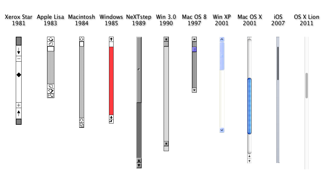
Scroll bars in the 1980s were functional but pretty ugly. Early scroll bars also let you shrink and grow a window, and it was fairly hard to understand what was really going on there. User interface design was a new art form back then, and it took a few years to understand what users really wanted.
After Steve Jobs left Apple briefly in the 1980s, he founded another company called NeXT. The NeXT computer used its own operating system and was the first to put a semi-realistic look to window elements like scroll bars. While putting the up arrow and down arrow both at the bottom was unpopular, the look of the scroll bar matured. This was the first time you saw the scroll area itself change to show you how much content there was — before that the scroll box was always the same size. There was also a little “dimple” to show users where to click and drag.
Fairly soon after that, other operating systems started getting a “touchy-feely” look to their scroll bars as well. The standard for Windows became three indented stripes in the center, as it remains today.
The amazing disappearing scroll bar
In the 2000s, Apple, once again helmed by Steve Jobs, continued to innovate the scroll bar. OS X made it more abstract, first with a “jelly” look and then with a cooler grey look. When touch operating systems invaded smartphones in the late 2000s, the scroll bar got thinner and lost its arrows. Why? Unlike mouse-based operating systems, smartphone OS’s let you flick anywhere to scroll, reducing the scroll bar to a simple indicator instead of an active control element.
The reason the graphic stops at 2011 is that today’s scroll bars have almost no character. They’re either grey boxes or white rounded rectangles. Scroll bars are as likely as not to disappear when not being used. They’re a visual cue that we don’t need anymore. They’re nothing but a holdover from an earlier age. They remind us when we (or our ancestors) needed some sort of training to know how to use our devices.
Now that things are more mature
It’s always fun to go back and look at old operating systems to see how far we’ve come. Who knows what the next iteration of the scroll bar will be? Will they disappear completely in the next five years? I tend to think they won’t.
User interface design seems to have stalled in the last five years. We all seem to agree on the basics of what a phone OS and desktop OS should look like. We seem to be past the point of innovation. In one way that’s good, because with so many people using these devices, small changes can create big problems. Certainly Microsoft learned that lesson when they tried to update Windows to version 8 several years ago. Still it would be nice to see some device “swing for the fences” with a new UI that didn’t rely on 1980s sensibilities. Maybe someday we’ll see it, with or without a scroll bar.


Be the first to comment on "Scroll Bars since the beginning of time"