
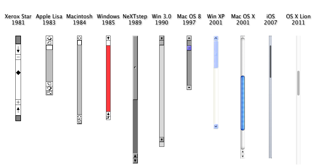
A while back, I took you on a tour of scroll bars since the beginning of time. You wouldn’t think this is a really hot topic, I hear you. But, hear me out. It seems to me that the way we interact with technology is literally the most important story of the last 50 years. It’s not just the technology itself. It’s the way that it’s rewired the way we experience life. Forty years ago, no one knew what a scroll bar was. Thirty years ago I struggled to explain them to people. (“Imagine you’re in an elevator and it goes up and down. You can only see what’s shown through the open doors.”) Today they’re invisible on most devices until being used.
Scroll bars went from nothing, to being incredibly important, to being so well understood that we can hide them when we don’t need them. As on-screen graphics got better, scroll bars got cleaner looking and at the same time, simpler. We experimented with having both up and down buttons at the bottom, we added and removed graphic elements. But they’re still here and still one of the most important ways we understand and experience our content.
Touch-enabled devices have made scroll bars less important, since we can scroll up and down with a flick. But even phones and tablets use them, because they just make sense at this point.
Play with some scroll bars from the past
I guess this graphic (which I show in the older article) wasn’t hip enough for 2019.
After all, why just look at scroll bars if you can play with them. This new page, courtesy of infomesh.org, lets you actually scroll using the scroll bars.
If you want the full version, check it out here.
Windows XP surprisingly wins the game
I can’t help thinking that of all these bars, the ones in Windows XP actually look and work the best. MacOS and iOS use disappearing scroll bars which are obviously the best choice for mobile devices. But if you’re on the desktop, I think Windows XP actually had it right. The bars are a gentle blue, which is surprisingly desirable. Today all scroll bars are grey and the overall look and feel of most devices is distinctly less colorful. We’ve also gone to really flat designs. This was a reaction to the overly tactile look of the 2000s (see the original OS X scroll bars) but I think we’ve gone too far.
We don’t need “skeumorphic” cues anymore with our devices. We don’t need our calendars to look like day runners or our cameras to look like old Nikons. We get it, we take these things for what they are. But, perhaps we can enjoy the subtle detailing of the Windows XP scroll bar with its pseudo-embossed stripes in the center. They call back to the hamburger menu, which as I’ve shown has a longer history than you think. The message is the same: to see more, use this.
User experience design has a tendency to move in cycles. That’s why Apple devices from the 2000s look like radios from the 1960s. We want things to look fresh and different, but sooner or later good design wins out. I have a feeling the next generation of scroll bars will look a lot more like they did in 2001. Just don’t bring back dial-up modems, Internet Explorer, or any other tech from back then and we’ll be fine.


Be the first to comment on "Scroll Bars, part deux: the interactive edition"