If you grew up before cable TV became common, you have a special place in your heart for PBS. PBS is, and was, a non-profit organization which loosely associates publicly-owned TV stations across the country. It’s not a “network” in the same way that ABC is, although the distinction is really not that meaningful.
In the days before cable, PBS provided a place for childrens’ programming without commercials, for the kinds of shows that wouldn’t be able to attract advertisers, and for unbiased news reporting. In other words, everything that early broadcasters hoped television would be.
Of course, PBS isn’t the utopia that it wants to be. Shows still take money to produce, and that means some limited sponsorship. It also means pledge drives, the hours-long begfests that made it so much harder to enjoy PBS before the days of the DVR.
One thing to like about PBS
PBS was established in 1969, right in the height of logo design. Logos from that era seem timeless, whether they are from Quaker Oats or International Harvester. Attempts to change them never seem to measure up, and we have a couple of superstar logo designers to thank for that.
The design idiom of the 1960s and 1970s called for large, blocky shapes without a lot of special effects. This was partically because of the technology in use at the time. Logos like that could be easily resized and reused by print shops that had just started using cameras instead of molten lead. If you want a good example of a logo from that day, take a look at this one:

An oft-quoted statistic is that at one point more people recognized this logo than recognized the American flag. It’s simple, makes its point, and looks completely at home even in today’s designs. It’s a shame it’s not used anymore.
PBS’s logo looked like this in 1971:

It was most commonly seen in an animated presentation just before programs:
and you can get some interesting information on how it evolved by watching this video.
Herb Lubalin was one of the masters of early 1970s design and he’s here talking about how this logo happened. It’s interesting to hear him talk about the psychology of the logo and its hidden meaning.
The way things evolved after that
PBS kept this logo for years, and eventually the naysayers got their way, too. In the video, Mr. Lubalin talks about how PBS’ head honchos didn’t like the left-facing head, because it reminded viewers that PBS often leaned left politically. Turning the head around wasn’t possible in the context of that logo, but when it was changed in 1984, they made a change:

To me the logo isn’t as good that way, because you lose the “P” in the head, but ok, it leans right to balance out PBS’ perceived liberalness. It’s still a good logo.
Problem Areas
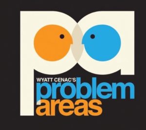
When comedian and activist Wyatt Cenac produced his public affairs program for HBO, he deliberately sought to evoke the early-1970s sensibilities of PBS programs. For his iconography, he chose two people butting heads, and each person looks “just a little bit” like the PBS icon:

It’s a tribute to Herb Lubalin and the essence of PBS in the 1970s. Luckily, the show never did a pledge drive. Still, I probably would have gone for a tote bag if they’d had one.


