

This week we go back to the advertising of the early 1980s. The 1980s were a special time in advertising because it was the end of one era and the beginning of another. On the one had you had more and more magazines being printed in color, because of improvements in technology and cost control. On the other hand had this increasing awareness of what people thought computers “should” look like, which was way way beyond what they could actually do.
The answer was to hire painters for these beautiful photorealistic versions of computer parts, screens, and interfaces. If you look at the box art from 1980s video cartridges, you’ll see what I mean. The actual screens may have been nothing but colored blocks, but the artwork on the box was superb.
Another great example is the covers of tech journals of the time, such as those from Byte magazine. Luckily a lot of them are stored at archive.org. This particular image happens to be my favorite:
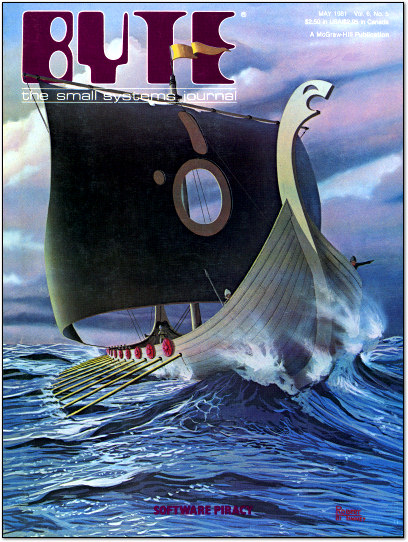
I remember this very magazine and read it from cover to cover. You can too, if you have the time. It’s 528 pages long. Yes kids, apparently we all had a bit more time on our hands back in 1981. But I digress.
Boomboxes as art
I wanted to point you to a page over at the We Are The Mutants blog showing the art of Ryo Oshita. The article is a little older but it doesn’t matter because it deals with content over 40 years old. Mr. Oshita was a fairly anonymous commercial artist tooling around in the early 1980s, and yet some of his art survives to this day. Check out this example:

I mean, who wouldn’t want a turntable based on that ad. It’s much more glamorous that the actual player, I bet. I found one very similar and when I look at it, all I think is “yard sale.”

I wish I could get as excited about today’s electronics.
Here’s the thing. It’s probably better that most of the stuff we use today is judged on its capabilities not its looks. Our phones are slabs of black glass and not much else. Our computers are big chunks of black plastic. In the last decade, thanks to Steve Jobs, the standard for industrial design is to have the device “fade into the background” when you’re using it.
That’s the point of advertising. Today, though, ads are all created on computers. Believe me, I love computers as creative tools. They make so many things possible. Unfortunately they also let people be lazy, which is why so much advertising today isn’t really memorable. At least nothing like this shining example from 1982. Someone really labored over this and that’s why it still looks like great art today. There are other examples at the link above too… and they’re worth a moment for you to look at them.
Even when you weren’t using them, you were glad you had them.
That’s great and all, but I do miss the days when high tech also carried a certain panache. These things were expensive, and you wanted the whole world to know you had them. Stereos were big and shiny and flashy. That was as much a part of the experience as using them.
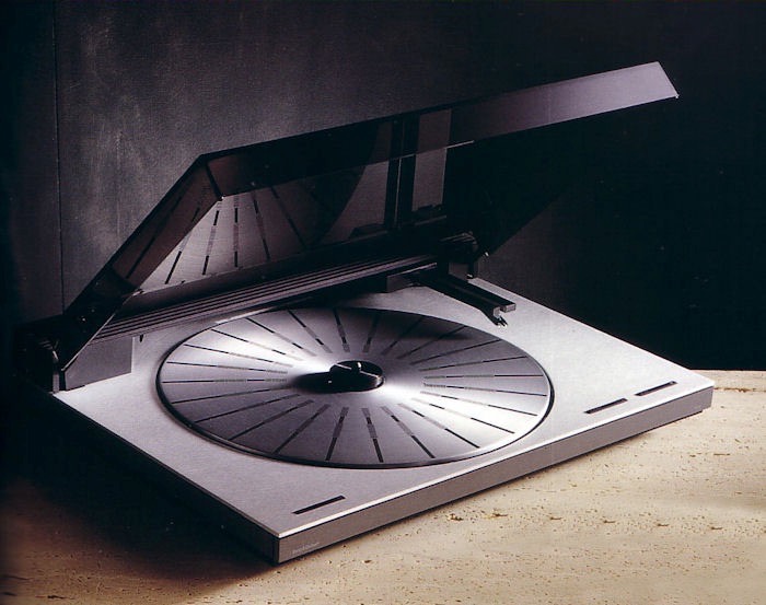
What you see above is Bang & Olufsen’s TX-2 turntable. I don’t know if it sounded better than the turntable I had, because I couldn’t afford it. What I did know is that it looked like the future. It made you forget that LPs were (temporarily) part of the past and not part of our future. Even when it wasn’t being used it was still something to be proud of. I wasn’t able to find an advertisement for one pained in that Ryo Oshita style, but then again it didn’t need one. It was so cool you just wanted it. My how things have changed. Or have they?


Be the first to comment on "FUN FRIDAY: The sound of space"