
This is the new branding for SYFY the channel once known as SciFi. I’m still not 100% sure why they changed the name to something that isn’t a word, but it probably has something to do with web registrations or trying to look current.
In case you,’ve forgotten already, here are their previous two attempts at branding:
![]()
Of all of these, to be honest the SciFi logo with the planet is probably the best. The new logo, which clearly takes inspiration from movies like Alien:Covenant and essentially any movie with horror or prisons in space, will look good at a bunch of sizes, but it’s not timeless.
The good news, as you can see in the animation below, is that they’ve already thought about how it will work in a variety of spaces.
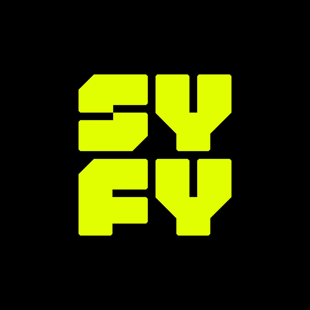
That’s important today, because you need a square treatment for your app (of course you have an app) as well as wider treatments that look good at the lower right of the screen. Stacking the SY over the FY helps out with the fact that none of the letters really stand by themselves. They’re barely recognizable as the letters they intend to be — especially the S — and overall they form something more structural than legible.
And, likely, more easily dated. Plain, legible typefaces stand the test of time. Clunky, overly-designed ones tend to go out of fashion quickly. Let me prove it to you.

This is Times Roman, which has been with us since 1931 and I’d bet a day doesn’t go by when it’s not used by millions of people.
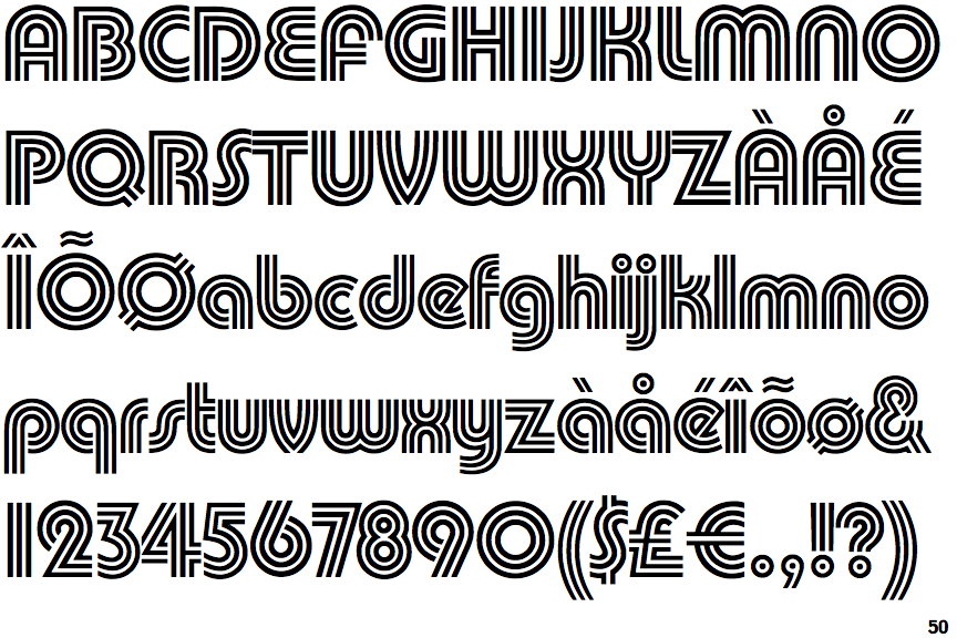
This is Pump Triline, which was super-popular in the 1970s. No one uses it today unless they are trying to make something look disco.
Times Roman is boring but it lasts forever. Pump Triline came and went. And the new logo treatment for SYFY, even though it looks fresh and interesting today, will look boring and dated by 2020, I’d bet. By 2040, when Times Roman (as well as Futura, the font from which the original SciFi logo was based) is still cruising along, the SYFY logo from 2017 will look like a creature from another time and place.
Oh well, redesigning logos keeps people employed and busy. Good to know that SYFY is contributing to the design economy
Be the first to comment on "SyFy channel changes it logo to something more prison-like"