
DIRECTV is rolling out even newer software for its new Genie menus. This new software addresses the issue of font size, which was still a concern for a lot of people after their most recent update.
The new software is being pushed to HR44, HR54, H44, and Genie 2 (HS17) customers.
Bigger is better
As I said, the big change here is text size. Text size has been increased in a lot of places but I wanted to focus on the guide and playlist because that’s where most people were complaining.
Please note that any differences in color are just due to the capture process. I don’t believe that the colors were changed.
OLD PLAYLIST
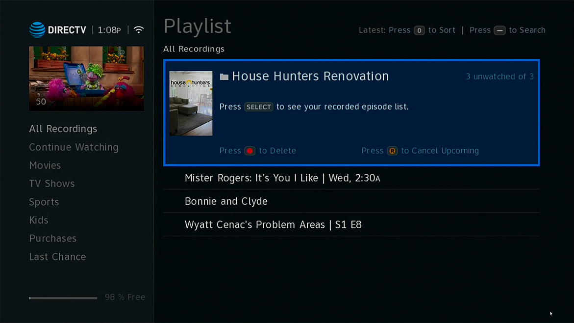
This is the old playlist from the most recent update, after some of the fonts were made thicker.
NEW PLAYLIST
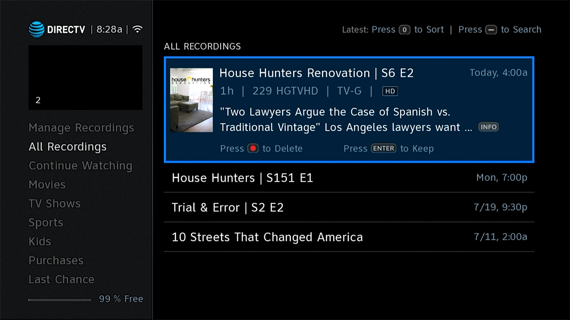
Here you can see that fonts have been made significantly larger. Also, Manage Recordings was moved to the top. When you press LIST, you go to All Recordings, and you can arrow up to Manage Recordings. This should be more intuitive than arrowing all the way down.
You can really see the difference in size in this side-by-side comparison.
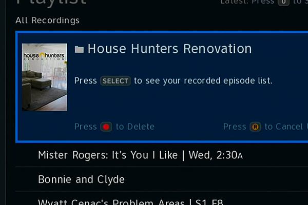
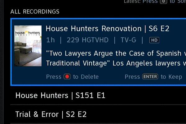
Slide the white line from the center to view more.
OLD GUIDE
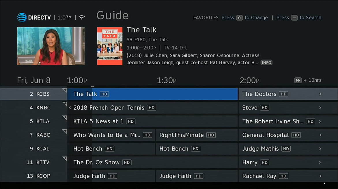
In this recent guide change, fonts got thicker and spacing improved. Logos on channels were replaced by channel names. It was a start but there wasn’t as much improvement as some people had hoped.
NEW GUIDE
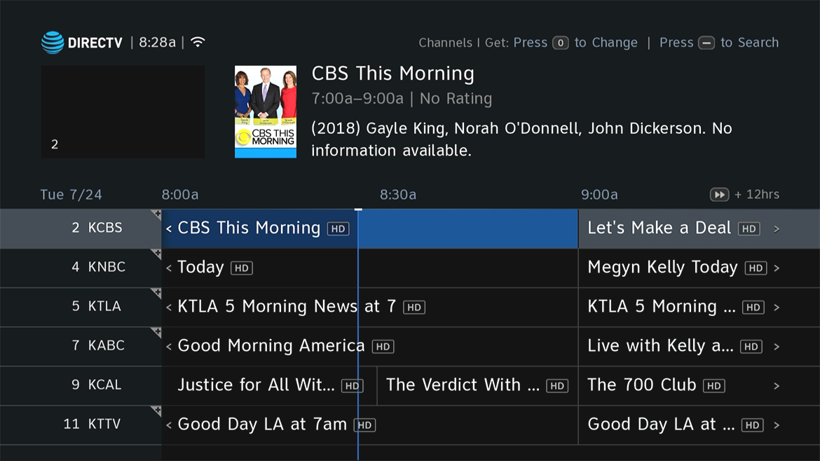
Here, the word “Guide” is gone to make room for bigger fonts all around. The number of stations on screen has been reduced by one to allow for larger fonts.
Instead of the grey-on-grey showing how much of a program has passed, you get a much more visible blue bar. Weirdly, the times actually got smaller, but I could see why: they were distracting and really you know what time it is now and you’re generally more interested in seeing what’s on.
The difference in font size is really quite meaningful. You can see it really well in this comparison:
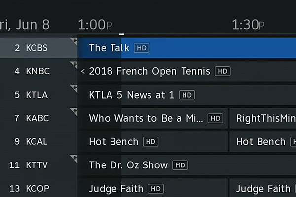
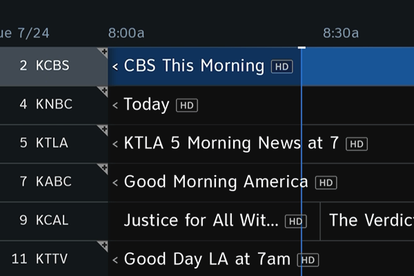
Slide the white line from the center to view more.
My opinion
I’ve said before that the folks at AT&T listen. So when you see something like this you know it’s the result of a lot of time spent reviewing call logs, social media channels, and focus groups. This is what people out there are asking for.
That said, I guess I would have liked to have the choice of the previous revisions and the new ones. The previous Summer 18 update screens were just about right for my mid-sized TV. These new fonts seem a bit too large personally. Of course I’m only one person and I really don’t mind the big fonts that much. It’s just that I was fine with the smaller ones, once the type was made thicker.
If there had been a switch you could flip to go between one and the other I would have liked that, but maybe that would have made things a bit too complex for older DVRs like the HR44. Wherever possible, AT&T’s team tries to support older hardware as long as possible. They’ve basically cut off development for the older HR34, leaving the HR44 (introduced in 2014) as the old man of the lot. Each new generation gets faster processors and more memory, so the challenge is always to support the oldest stuff.
More than anything I think it’s great that AT&T engineers jumped on this and provided improvements based on customer feedback. The result may not be perfect for everyone, but the process really is. It’s great to see a company like AT&T listening when people talk.


Be the first to comment on "HANDS ON REVIEW: Even more changes to New Genie Menus"