
Oh golly, has it been almost six years? I wrote this article in 2017, talking about the appearance of the AT&T “globe” logo on new DIRECTV hardware. Back then, I would not have guessed AT&T would have spun DIRECTV off as an independent entity. Yet, that’s what they did. Although AT&T still is the majority owner of DIRECTV, they have no operational control.
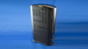
Since that spinoff happened, things at DIRECTV have gotten better and better. There’s a new spirit at DIRECTV HQ, a fresh new look to the advertising you’re seeing a lot more of, and yet there is no new hardware with the new DIRECTV logo on it. In some cases, like the company’s SWM-30 multiswitch, that globe is literally cast into the fuselage of the thing. In most other situations, though, it’s nothing more than a silk screen or a sticker. So what’s taking so long?
That darn reliability
What’s really to blame? The fact is, DIRECTV hardware is so reliable, there isn’t a huge demand for new hardware right now. Many of the receivers and DVRs that were out there before the AT&T acquisition are still working, as are the vast majority of boxes made in the last five years. In most , a shrinking customer base is taking up enough slack so that there just doesn’t need to be a new production run of most things.
That will change eventually, of course. We’ll start seeing new logos on new receivers at some point. I expect the first sightings to be on streaming equipment and accessories. It will happen, and I’m sure if you’re like me, it can’t happen too soon.
When it’s time to change, you’ve got to rearrange
Now, I have nothing against the globe logo. It’s the successor to the original AT&T “Death Star” logo created by famed designer Saul Bass. He’s one of my favorite commercial artists personally. It’s just that it doesn’t represent the new DIRECTV. They need to find a logo that will.
Honestly, I’m not even that sure what logo they would use. The current logo, at the top of this article, is just a word with a swoosh in it. I don’t mean to put down the hard-working people who created it, but let’s simply say it leans hard on history. I guess they could use something like the current app logo, which looks like this:
I’m not sure that’s the best looking or most unique mark in the world, but it would at least work at a lot of the smaller sizes needed for parts and accessories.
In the meantime…
I guess my advice is not to let it get you down too much. I mean, it was a much better writer than I who once said, “A rose by any other name would smell as sweet.” If you need a DIRECTV upgrade now, don’t wait just because it has an old logo. Instead, call the experts at Solid Signal. We’re here for you during East Coast business hours at [email protected]. Or, shop the great selection of DIRECTV stuff at SolidSignal.com. If you need help and it’s after hours, fill out the form below! We’ll get back to you, usually within one business day.

Be the first to comment on "When will DIRECTV take the “Globe” logo off their receivers?"