
I don’t know if you caught this teaser for Stranger Things Season 3. I am sure Buckler did, he’s a huge fan of the show. For the rest of you, here goes. It’s short, I’ll wait while you watch it.
There isn’t a lot here to tell you about the next season of the show, other than Steve works at a hot dog stand. It’s a bit of fun that the production team probably did in an hour or two from footage they shot of other stuff. That said, I fell like I have to pick it apart in a lot of ways. So feel free to leave now if you’re not ready for some serious fanboi nitpickery.
What it gets right
The general look of the mall is right on. I’m pretty sad to say that the producers probably didn’t have to go far to find a mall that looked like this, since most shopping malls today look like this. The internet (always a reliable source of information) says the actual filming location was Gwinnett Mall in the Atlanta area. The mall looks very similar to malls I remember from the 1980s with an A-frame roof and two-level design. They get points for that, as well as the use of fluorescent tubes (which people usually call neon, but technically only the red ones use neon.)
I also think the branding looks about right, with The Gap, Walden Books, Chess King, and Sam Goody looking the way they looked in my youth.
The Hunt For Red October was a bestseller in 1984 so that’s right too.
What it gets wrong
I know. This was probably thrown together quickly. Still, the opening animation is SO totally Google Earth, which wouldn’t be around for another 25 years. I was put off from the start.
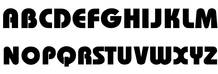
Believe it or not the titles and graphics are probably too advanced for the day and I’m not convinced they would have looked like that. Typographically I think it’s more likely they would have used this font:

or this one, which isn’t quite the same:

These fonts were EVERYWHERE in 1984. I would have expected them with a “starburst” effect around them. The font that was used here, Bauhaus Heavy, was considered dated at the time and probably wouldn’t have been used for a new expensive commercial.
It’s not just the typography. Hot Dog on a Stick makes an appearance, and to my knowledge that chain was only in California at that time. It’s never been in Indiana and still isn’t today.
While we’re in the food court, I don’t quite buy the menu board shown at the Orange Julius at about 1:00, and just before it is a kid with really period-inappropriate glasses.

Why do I care?
I’m not going to pretend I’m a massive fan of Stranger Things. 1980s preteen angst is something I’m more than happy to forget, and if I really want something like this, the cinema of the actual time is more than happy to oblige.
However, I’ll give it to the production crew of Stranger Things for generally being slavishly accurate in their portrayals of 1980s middle America. This is obviously a throwaway piece but if it’s indicative of the attention to detail we should expect from the whole season, I’m a little worried. The sets and costumes have been the only really resonant thing for me on Stranger Things and if that’s gone…


Be the first to comment on "Starcourt Mall"