
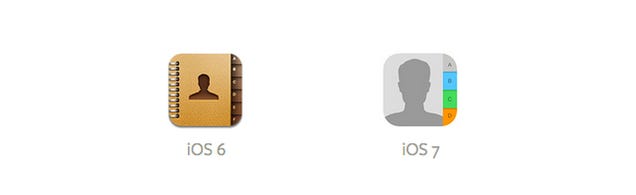
In those faraway days of 2013, it seems I had nothing better to worry about than the fact that iOS was doing its first visual refresh. The iOS look and feel that started in 2007 was going away. That meant the comforting, real-life-inspired icons the past were getting flatter and more abstract. Witness the “controversial” makeover of the contacts app:
The whole look and feel of the phone was about to change, with “shiny 3D stuff” going away and “bright-colored flat stuff” coming in. Take a look:
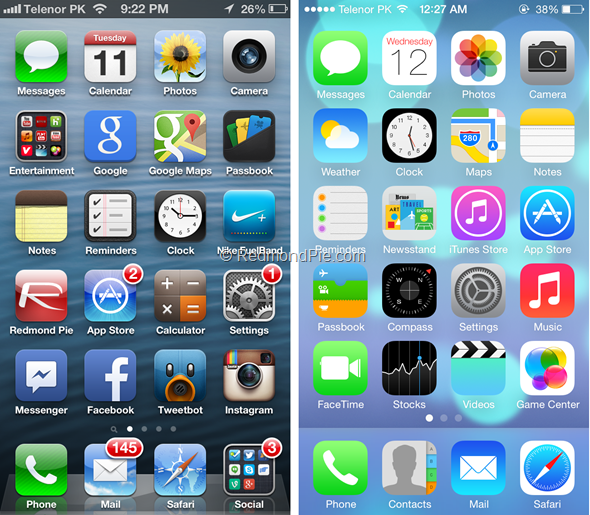
Now, today that left side image looks incredibly dated but back in 2013 it was comforting. That right side image was jarring and worrisome. Thousands upon thousands of words, including mine, were written either praising or condemning the then-new design.
Will we ever see another change?
The “flat design” look was very avant-garde 9 years ago. Moving to thin fonts, getting rid of unnecessary effects, and all that stuff seemed to happen overnight. It was almost like we all woke up simultaneously from a photoshop-induced stupor and said, “hey this doesn’t need a drop shadow, does it?”
But folks, that was 2013. That was nine years ago. At this point you have to wonder if iOS will ever really change, considering that it has barely changed in that whole time. If you think about it, the “old” iOS look really only lasted 5 years, and the “new” one has lasted about twice that.
It makes me wonder if Apple will ever have the courage to make such a large change again, given how many users would be affected. I have to say, I hope they do. There’s nothing inherently wrong with the way iOS looks, but it’s certainly less exciting than it was. I’m sure that whatever they did would risk some backlash. It’s fair to say I probably wouldn’t like it. I don’t terribly like the changes Windows 11 has made, but I’ve gotten used to them.
The changes I, personally would make
First, I would keep the gently rounded edges. Although I haven’t liked them in the past, they’re sort of in vogue now. I would keep the colors of the main apps, because that’s how people find things. But I would look to icons that seem a bit more modern. When was the last time you picked up a phone handset that looks like the one in the icon? When was the last time you wrote a real snail mail letter and put it in a real envelope? Sure, people kind of understand these icons but it’s time for a new aesthetic. I would also discourage using any representation of letters. The iOS app store uses shapes that form an “A.” I think we can do better than that. The only visible letters and numbers should be on the calendar and clock apps. (And seriously, ditch the analog clock already.) I would even allow the user to get rid of app names under the icons if they wanted.
But I doubt any of that will happen.
It just seems that iOS and Android are too set in their ways now, with so many users, there would probably be too much of a hew and cry if anyone made a big change. Of course we all know that’s just a stepping stone. When you start listening more to the old, established guard, you risk turning off the people who will want your product 10 years in the future. Apple and Google might want to ask the folks at Blackberry how that strategy worked for them. “Just sayin.”


Be the first to comment on "THROWBACK THURSDAY: iOS Changes its look"