
UPDATED: They listened to your complaints! Check out the revised menu screens in our Summer 2018 review.
EVEN BETTER: More changes in our August 2018 update.
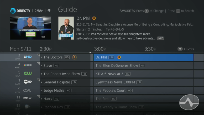
Get a look at the future of DIRECTV! It’s been six years since DIRECTV rolled out a user interface refresh for its DVRs and receivers, and although the old menus worked great, they looked a little dated by today’s standards. You know what I’m talking about — those thick letters and cloudy backgrounds just sort of scream “first generation iPhone.”
If you have a Genie DVR (except the first generation HR34 Genie) you’re about to have a whole new experience. All the screens and menus have been updated and they look a lot more contemporary, as you can see in the picture above.
It’s not just the colors and shapes that have changed – there’s a new emphasis on the basics. Casual users will find it easier to search, easier to set up recordings across multiple channels, and easier to find something to watch without diving too deep into menus. The new interface uses pictures instead of words whenever possible and that should make for a more immersive experience. The menus and button assignments are designed to work with the Genie Remote, and that’s meant some things have moved.
What’s interesting is that those kooky cats over at the Edgecutter Forums, who do a lot of AT&T’s pre-release testing, aren’t so happy about the new menus. Seems they were disappointed that some power-user-friendly features changed, and for them that means it’s worse than the old one. Personally, I would have liked to have seen some changes that I didn’t see, but I think for the 24 million or so people who use DIRECTV satellite service every day, it will be a welcome visual change and they’ll appreciate the new stuff more than they miss the old stuff.
The new menus will be rolling out to HR44, HR54 and Genie 2 (HS17) users throughout the rest of 2017. I don’t recommend that anyone try to force a download onto their systems. It will come when it comes, and this is a slow rollout to try to make sure that there aren’t any issues that need to be fixed.
Throughout the next few months, we’ll be producing videos to help you get the most of the new menus as well.
In the meantime, you can get a great glimpse of the new menus by reading our exclusive review in PDF form! Be sure to zoom in on all the images to get a great idea how the new menus look and perform!


In the PDF it says that you can filter your playlist by hitting “0” instead of the old yellow key but all hitting “0” does is changing the sorting order. How does one filter the playlist to “local” or “all”?
Interesting question. Let me see what I can find out.
Thanks Stuart. I hope they haven’t eliminated that functionality.
They haven’t. They just made it harder to find. I asked someone with a multiple DVR setup and they showed me how to do it.
LIST > arrow down to Manage Recordings, SELECT.
Arrow down to Playlist Share Settings, SELECT.
Top item is “Show recordings from” and you can choose “All locations” or “This Location”
Bizarre. When I look at my Playlist/manage recordings the “options” are: 1) Upcoming recordings; 2) Series manager; 3) Recording history; 4) Purchase history; 5) Manual recording setup; 6) Typical recording preferences. There is not “show recordings from”. I am doing this on my C61k.
Keep arrowing down past “Typical Recording Preferences” and you’ll see “Playlist Share Settings.” I’m looking at it on a C61K right now.
I do see that option on my HR-54.
I know you are going to think I am crazy but there is nothing after “typical recordings preferences”. I just hear the “you can go there” sound.
I don’t think you’re crazy, it’s just not consistent with my experience. Here’s the exact key sequence I used:
LIST
LEFT
CHANNEL DOWN
RIGHT
CHANNEL DOWN
DOWN
At this point the Playlist Share Settings is visible.
I did this on the C61K attached to a Genie 2 at the office.
I am wondering if there is something I need to set on the HR-54 to allow the C61K to have its own playlist filter capabilities. As i mentioned before, I can see that menu on my HR-54.
It’s odd because there are no other DVRs on the same network as the Genie 2 and it still has that option. In fact with a Genie 2 you can’t have any other DVRs on the account. Still, perhaps go to the HR54’s menu and set all the options in the Playlist Share Settings to “Allow” or “Yes”, this may enable the menu on the C61K.
That is odd. The options are all “allow” and “yes” but I will play with it again. I will also check my other c61k. Thanks for looking into this.
I do see that option on my HR-54.
Thanks for your instructions on how to use this extremely annoying and time-wasting change. This change has made something that was easy to use in the past extremely complicated. Now I have to choose 3-4 menu items to get to the same place that as of yesterday was 1 click. I still don’t know how playlist works after spending 54 min 56 sec. with DirecTV customer service. He said I had to provide him with my model number either from my paperwork or on the back of my DVR. I should not have to dig this information up myself. He twice sent me the user manual for my model number that he was able to get from my account number. The manual DID NOT EVEN ADDRESS THE ISSUE I CALLED ABOUT. I felt sorry for him that AT&T had not provided the info to him to assist me and effectively do his job. This new setup sucks. It is overly complicated, cumbersome, annoying and unnecessary. Go back to old menu. Maybe you are trying to compete for business with the millenials. I have 2 sons and a daughter-in-law in their early 20’s. At this point in their lives, they would NEVER pay the high prices for cable/satellite service. Your business caters to an older crowd and you are pissing us off. I got an email telling me of the changes without any guidance. At least do that!!!
Sure, you can change that setting all day long but you won’t be able to see recordings on other DVRs in your home. From an HR24 I can see recordings on my HR44 and also on my other HR24, but from the HR44 nothing remote is visible.
This is an acknowledged bug that they seem to be in no hurry to fix.
“The new interface uses pictures instead of words whenever possible and that should make for a more immersive experience.”
I am an adult, I can read – I do not need or want pictures that I have to interpret to find things. Finding programs is not supposed to be an “immersive experience” – it is supposed to be easy.
This annoys the heck out of me, too. I DON’T READ PICTURE. HATE that crap. Just SAY what it is.
I don’t dislike the new interface as much as others do but one thing I do not like is that the channel number, station and current program aren’t near one another when you hit info or you are scrolling through channels. They stuck the channel and station all the way to the right while the program is on the left. I prefer to see all of them at once and not have to shift my eyes left to right.
If it ain’t broke don’t fix it- dumb asses. Age has got to my eyes and now need a pair of ef’n binoculars to read the channels and descriptions. Pushing twice the amount of buttons to view recordings etc. Some one in management must of thought of this brain ef’n brilliant idea -otherwise it wouldn’t get off the ground. wtf
Holy judas to hell and back- what’s next a minature remote you need microscope to read-SOB
I’m with you, Dale! This new update is a piece of crap! We’re seriously thinking of going to Dish or cable……not going to deal with this piece of shit….no way!
In a word, the new interface changes SUCK! I can’t stand the color scheme, it actually looks like something has shorted out….. And as others have said, in an attempt to make it more User Friendly, you’ve gone and made it more troublesome to navigate thru the Guide…….. Overall Grade = F.
Exactly! Mine downloaded yesterday and there are a lot of things I don’t like about it. I called to find out if I could get help locating some things and this guy went into a really pushy sales pitch. I had to hang up. Problem still not solved. It’s because AT&T took over Directv. We should get used to terrible service.
I completely agree that this interface is terrible! The black and blue background is harsh on the eyes; the white lettering on the dark blue background is hard on one’s eyes and way to small; the “tv” window is smaller; when pushing the pause, ff/rev button 1/3 of the screen is used up by unnecessary fading black; everything melds together; I liked that each show in the list was easy to read and that it told me in one glance what day I recorded it, what channel and what time it was recorded.
I think AT&T is trying to look like Amazon, Netflix, etc tv interface.
THE INTERFACE WAS NOT BROKEN!!
I would imagine there are more unhappy than happy people about this.
I have been a Directv subscriber since 1995 and have never complained until now!! Fix it or I’ll go to the competition now that they carry Major League Baseball!
Saw this interface in AZ in Dec. wasn’t impressed then and now that I actually have to use it daily, I’m REALLY unimpressed!!!!
I saw the playlist and thought I had accidentally changed a setting to a mode optimized for tablets. But apparently not..are you kidding???? On a 40 inch Samsung the left 1/3 of the screen is wasted with a kids/sports/movies/continue watching menu, while the list of recorded shows is in a smaller font with more space. And the top item in the list always in the big blue box, like it’s a heading or something. Items in a list should look the same unless they are selected for more detail.. Viewer is helpfully informed the Red dot key on the remote deletes the program, but is left to guess which key to press to WATCH it. Press zero to sort, and the list toggles, but the viewer must guess what it’s sorted on…alphabetical, newest first, unwatched first ??? And if you press the INFO key when the big blue box shows, you see LESS info about that particular show. And while in the info mode, the viewer might want to see upcoming episodes of THAT SHOW, but instead there is a selection to see MORE SHOWS on that channel, which takes the viewer to the on demand menu with the “DVD Box” format listing of shows having nothing to do with the selected program. And the (record) button now means (record) or (not record) depending on whether is program is already scheduled to record or not..
This is just inexcusable, it breaks all the rules of lists and menus that makes using it logical and intuitive.
Okay, it isn’t just me.
Nope. I was appalled at first (especially by the unannounced and irreversible hard cutover), but there are aspects that are starting to grow on me. I’m finding I like the semi-transparent INFO screens and the new “progress meter” on each entry in the Recordings list so you can see if or how much a recording has already been watched. On the other hand, it’s a complete mystery to me why they’ve buried the “Manage Recordings” menu so deep that you get a hand cramp from all the button presses by the time you’ve reached it!
Overall, though, I’m disgusted by the cavalier attitude so many companies (including DIRECTV) have toward User Interface (UI) changes and the apparent disregard for their customers’ time and attention. The App Era seems only to be making this problem worse as app developers think nothing of constantly overhauling their UI as some misguided sign of improvement…
P.S. I would LOVE to be able to fine or otherwise charge a company back for my time spent learning and/or dealing with their arbitrary UI changes. The person who figures out a way to do that is going to hit the jackpot!
You should see how unintelligible and impossible to see/read on an old style non-hdTV. They clearly didn’t test it with those tube tvs OR with those of us who can’t see worth a crap — and crap is what they give us. We’re changing. buh bye DTV you corporate fascist idiots.
Could care less of the way it looks, personally I think it’s about the same as before although I have 1 issue:
THEY TOOK AWAY MEDIA SHARE!!!!
I miss being able to stream files from my computer through our genie. Complement features directv, dont take them away 🙁
My spouse is a Baby Boomer and I am GenX. We are not old but are having a VERY difficult time reading the title of each show/movie and its contents. We struggled with navigating the new interface and reading the words on the screen. (The pictures are not always helpful but certainly useless when reading the title contents.) My spouse and I help take care of senior citizens so we have no other choice but to end the three services we pay for! Why on earth would we pay for something that no one is able to enjoy? Because of DirecTV’s disregard, we have no other choice but to cancel all three services.
The new guide is horrible. We have 5 tv’s in our house and not one of them can we read it from our normal tv watching area. We actually are back in the 1960’s and have to walk closer to the tv to go through the guide. Big business doesn’t care about the user – this is a prime example.
This is DTVs equivalent to Coke changing their original formula debacle. This new guide will long be remembered as such.
This is DTVs equivalent to Coke changing their original formula debacle. This new guide will long be remembered as such.
Anybody figured out how to get into series manager? I record an ESPN series and I’m getting it on multiple channels, which I don’t want.
List button, left button, down to Manage Recordings. If you’re getting something on all channels, delete the series link and create it again using the DIRECTV app for smartphone or tablet. That usually works.
Stuart, you saved me 🙂 This is what I needed to find out when I called customer support and had to suffer through a long, sales pitch – I hung up on him.
It sucks big time. I want the old one back.
Absolutely NOT USER-FRIENDLY!! Annoying, confusing, time-wasting…and the Music channels have also changed from Sonic to Music Choice, eliminating My favorite music options!
I think it’s time to consider my TV options.
Hate new format.Trying to see Voice from Monday, but can’t.
All can do is watch Tuesday 1st.What is the point.Hate it.
Hate it. Not user friendly or efficient at all. Takes too long to get the information about the show – especially date of first airing. Looking for another provider – hate this that much.
This new UI is horrible. It is completely disorganized and there’s so much wasted space. Even on a 55″ TV the font is just way too small, unless you’re very close to the screen.
Epic fail.
This IU stinks I’m 78 years old and finally got comfortable with the previous system and now you throw something at us that looks like two steps backward. I would go into my playlist once a month and clean out old recordings to free up space and that feature is gone, Spent half an hour on the phone with customer service and found out the iU is still being worked on, this is so like large companies somebody has to make an impression on their boss by making a big splash and all it does is piss everyone off. Whoever was responsible for this one should be fired.
IT SUCKS, I Hate it, ATT Sucks, this is what happens when you outsource to people who do not understand what you want or what you need and say, we will fix it no problem no matter what question you ask them, or they will say, ok buddy, we will fix it most quickly, Wow, Are you people just plain stupid or what? But I have a way to fix it, IT’S CALLED CANCELLING MY SERVICE… Screw you ATT. Wonder what this is all about, well when you see it, you know right away that they intend on using a lot of your screen as a method of advertising, so when you look at a show or you check on what is going on in other channels, your going to likely start to see huge advertising, well that breaks the terms of service, ATT so Im Out. I really hate ATT they used to be a decent company years ago, but now all they do is suck and blow and not in a good way.
Ok, let’s ignore the issue that the aesthetics of the menu tends to blend everything together and makes it hard to visually differentiate what is and isn’t available. My biggest issues are the menus seems slower and takes up so much more of the screen. You hit info and it covers most of the screen. If I could swap back I would in a second. A big thumbs down from me.
I hate it
I hate it
I rarely comment on things like this, but my family and I hate this new user interface. We gave it over a week to try and get used to, but it totally sucks!!! I am a software engineer, specializing in usability testing, obviously this was not tested with a representative sample size that most accurately represents Direct TV customers. Otherwise they would have never pushed this update out to everyone. Font is too small, wasted space, icons that takes up too much room and are hard to read. The playlist is total unusable.
I CANNOT SEE THE WORDS!!! I CANNOT SCROLL THROUGH THE MENU AND TELL WHICH CHANNELS ARE MINE SINCE EVERYTHING IS THE SAME COLOR!! ON THE OLD GUIDE, CHANNELS YOU DIDN’T HAVE WERE BLACKED OUT…WHAT HAVE YOU DONE & WHY?? CONTEMPORARY??? WHO NEEDS THIS! AND WHOEVER WROTE THIS ARTICLE IS LIVING IN LA LA LAND….JUST LIKE EVERYTHING ELSE GOING ON NOWADAYS! TIME TO FILE SOME COMPLAINTS.
OK, I understand you’re unhappy and I get that. You have every right to be unhappy. However, What you’re saying isn’t true. There is a difference between channels you get and channels you don’t. I’ve attached a picture. I wrote the article and respectfully, I don’t live in la la land. If you look at the picture, I get channels 402 and 404. I don’t get channel 403. There is a clear difference between the channels I get and the channels I don’t. Is it possible you may want to adjust the contrast and brightness on your TV? https://uploads.disquscdn.com/images/638a9506432219cf07f37b0754cb2203b2272f9de16996c511bab1f611655433.png
I hope you don’t think that is a notable difference. The difference is minimal zoomed in like this picture is. From across the room it’s even worse.
I have to agree with grizzledgamer on this. There is not really a “clear” difference between the text colors in this example, and for the typical tv viewing distance it is even less clear. I know that I have had trouble with this since the changes.
My guess is that this is an intentional design feature, employed in hopes of getting me to accidentally select a channel that I don’t get so that MAYBE I will subscribe or agree to a pay-per-view purchase. Maybe I’m too cynical, and this is simply the product of truly clueless GUI designers.
To change back to old guide hit the reset button on the directv box.Then as soon as the lights on front of box come on use your remote and enter the code 02468.This will make your box do a new download and will put the old guide back on.
That isn’t really true. It doesn’t work at all with Genie 2, and with the older Genies it may not work depending on what software is on the satellite at that moment. If it does work, it will only work for a few days until the new menus automatically load again.
That isn’t really true. It doesn’t work at all with Genie 2, and with the older Genies it may not work depending on what software is on the satellite at that moment. If it does work, it will only work for a few days until the new menus automatically load again.
Have you done away with the ability to jump to a date and time on the guide? Can’t find it. That’s one feature I use ALL the time. Also, the font is too small. Can’t read it from a normal viewing distance, and I can’t be the only one with this problem.
It’s still there, press the zero button. I realize they don’t say that anywhere. Here’s an article about it. https://blog.solidsignal.com/tutorials/can-sort-guide-new-genie-gui/
It’s still there, press the zero button. I realize they don’t say that anywhere. Here’s an article about it. https://blog.solidsignal.com/tutorials/can-sort-guide-new-genie-gui/
In two words..,IT SUCKS
New is not always better. It was clear, not cluttered and easy. Oh, i forgot, it was out dated….Thanks, love to see how many customers you loose with this boner move
In two words..,IT SUCKS
New is not always better. It was clear, not cluttered and easy. Oh, i forgot, it was out dated….Thanks, love to see how many customers you loose with this boner move
I hate the new interface … It is NOT User Friendly and very hard to read. Is there a way I can get the old interface back. It was so easy to use.
EXACTLY!!!!
Just got the update
Such a huge loss of functionality, so much wasted space.. looks only half finished. A guide that only let’s you see 1.5 fours a time? , audio issues on some recordings
I left dish network after 18 years for the same BS
Two words: New Coke Try again Direct TV
Horrible! Contemporary? Yes. Functional? Not so much. Readable? Not at all!
Two words: New Coke Try again Direct TV
This new format is awful. I hate it.
This monstrosity just rolled out to me last week.
I work in the medical device industry, and something this completely atrocious would be grounds for a product recall!
Part of any interface testing involves using HUMAN users in your user group. Clearly this was not done here. The guide is horribly cluttered, the fonts unreadable. Guess it’s time to check out Spectrum and Dish!
Can we have the option to use the new format or old. i.e. the approach Microsoft uses on screen formatting?
Direct can keep their new future. I can’t see it, and it is impossible to read and is definitely NOT user friendly. I gave them 2 weeks to change it back or I’ll switch service. This is definitely not worth what they charge for the luxury of using their service.
The interface has gotten way worse, this is no improvement at all. Clunky, horribly slow, not intuitive, impossibly hard to read. An embarrassment to anyone involved. There was clearly no concept of effective human engineering or qc. I cannot believe that this was field tested at all. This is a a failure of epic proportions for whoever led this design effort. All those responsible should be fired.
The to do list can be found by press LIST then arrowing over and down to “Manage Recordings.”
The to do list can be found by press LIST then arrowing over and down to “Manage Recordings.”
Stupid