
Even more changes in store! Check out the August 2018 update.
You talked, they listened. I told you they would, and now I can show you.
When DIRECTV revealed their new menus in November of last year, they weren’t the huge hit everyone hoped for. Some said they were hard to read. Others said there wasn’t enough contrast. Some didn’t like the glowing and fading around things.
I held out hope, and I know you all did too. I can now confirm that DIRECTV customers are now starting to get a revised version of the new menus that takes some of these concerns into consideration. Overall, type is thicker and appears brighter. In some key areas, it’s bigger too. In a few areas the type actually got a tiny bit smaller but it still seems more legible because it’s not as thin and not overly tall or condensed. While some of the “fades” are still there, others are totally gone. It’s easier to show you than tell you.
One quick disclaimer: Since I took the initial screencaps, I have received some new hardware that has a tendency to make things look a bit sharper and brighter. As far as I know they haven’t changed background colors, even if they look different in these screencaps. I do think text has gotten whiter overall.
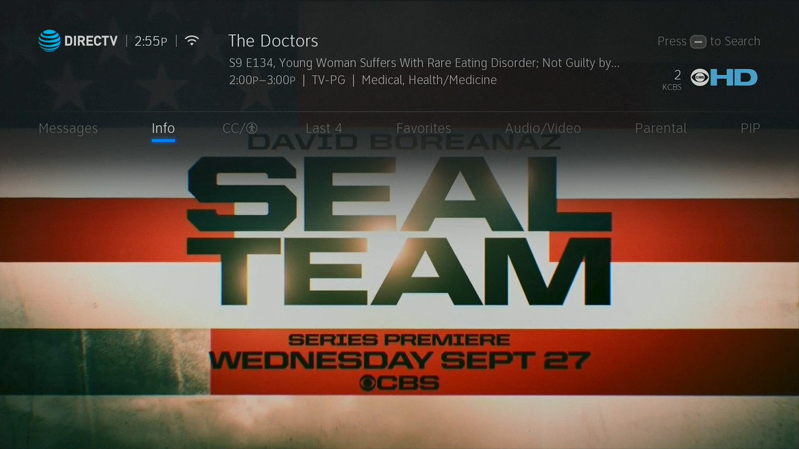
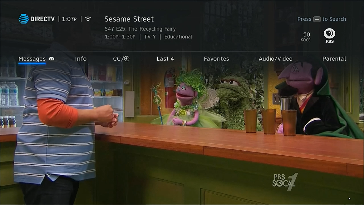
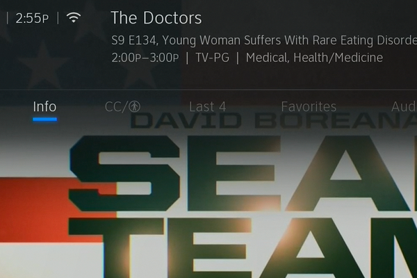
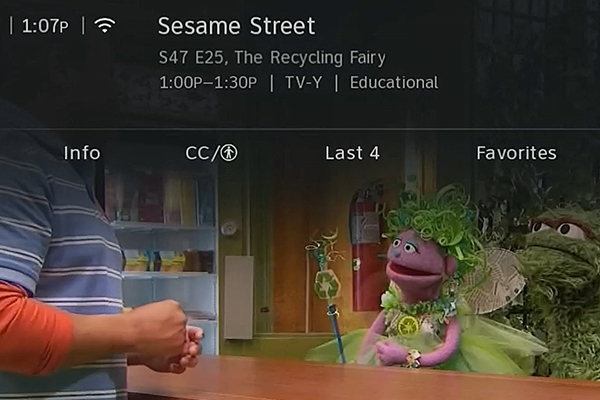
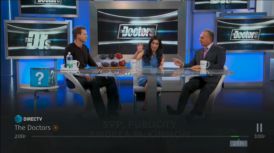
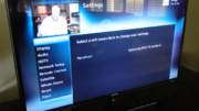
Info Bar
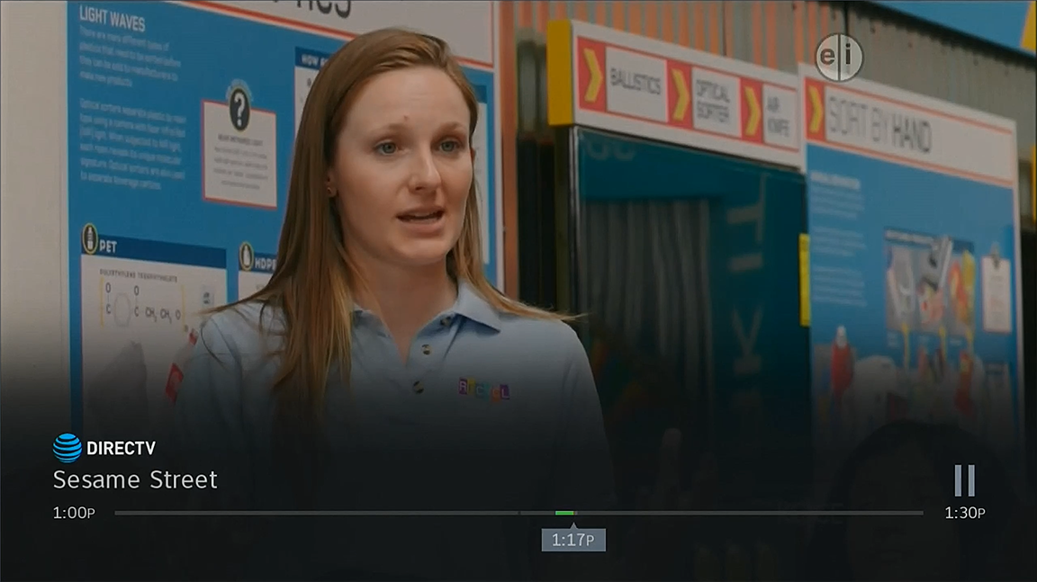
The info bar has been improved with larger text and slightly different placement in some areas. The rest of the text can now be seen by pressing INFO. The first set of captures was done on an HR54 so the PIP menu is visible. The second set was done on a Genie Mini Client without PIP.
OLD
NEW
COMPARISON (slide to compare)
Progress Bar
Very few changes were made to the progress bar but there is a little thicker text. The fade underneath the bar is still there.
OLD
NEW
COMPARISON (slide to compare)
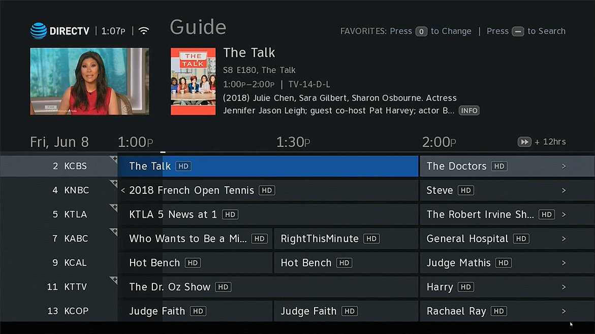
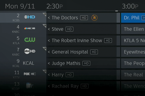
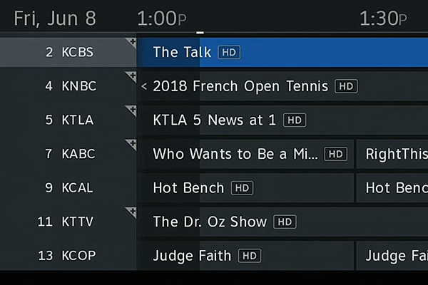
Guide
Here’s where you see a lot of attention being paid. The logos next to the channel numbers are now gone, making the guide look a lot more like it did. The text has gotten thicker and appears brighter overall, and the fade is gone from the bottom. This does leave a black box but on most TVs this will be cut off.
OLD
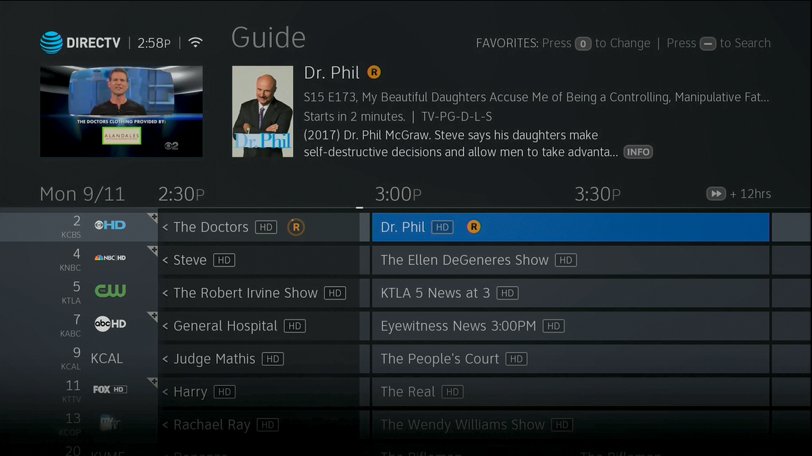
NEW
COMPARISON (slide to compare)
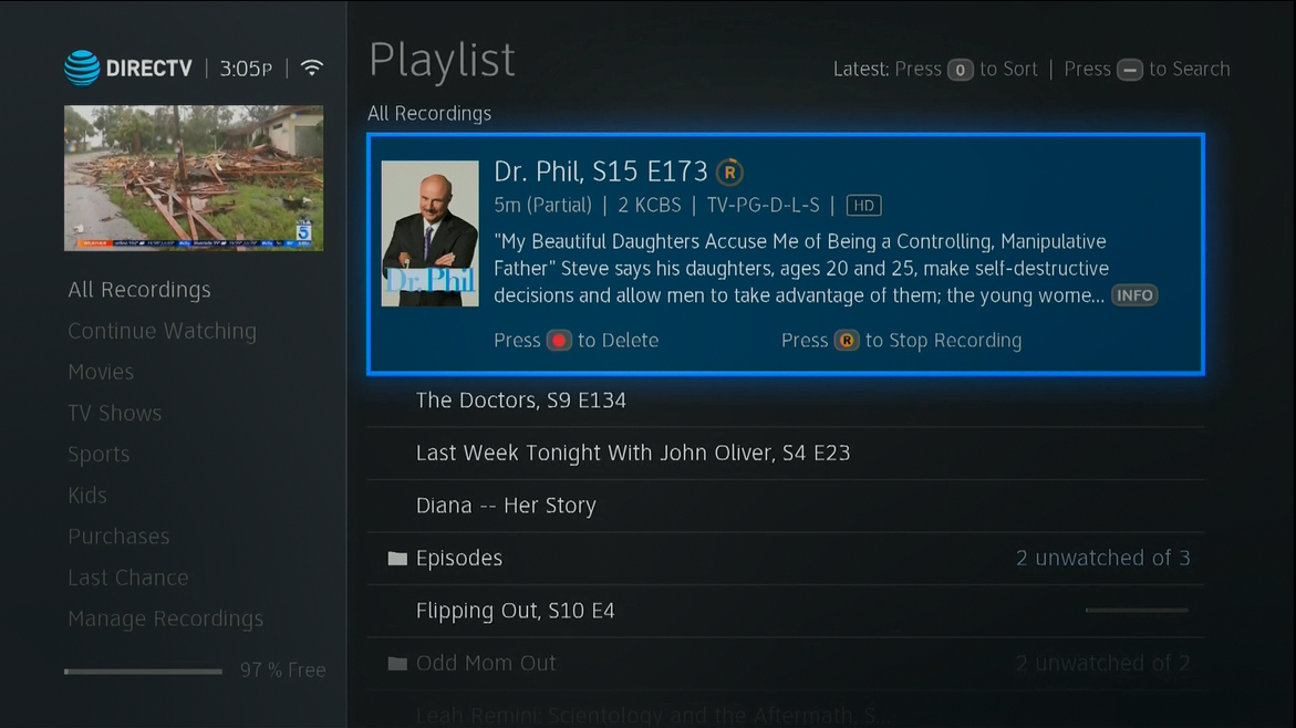
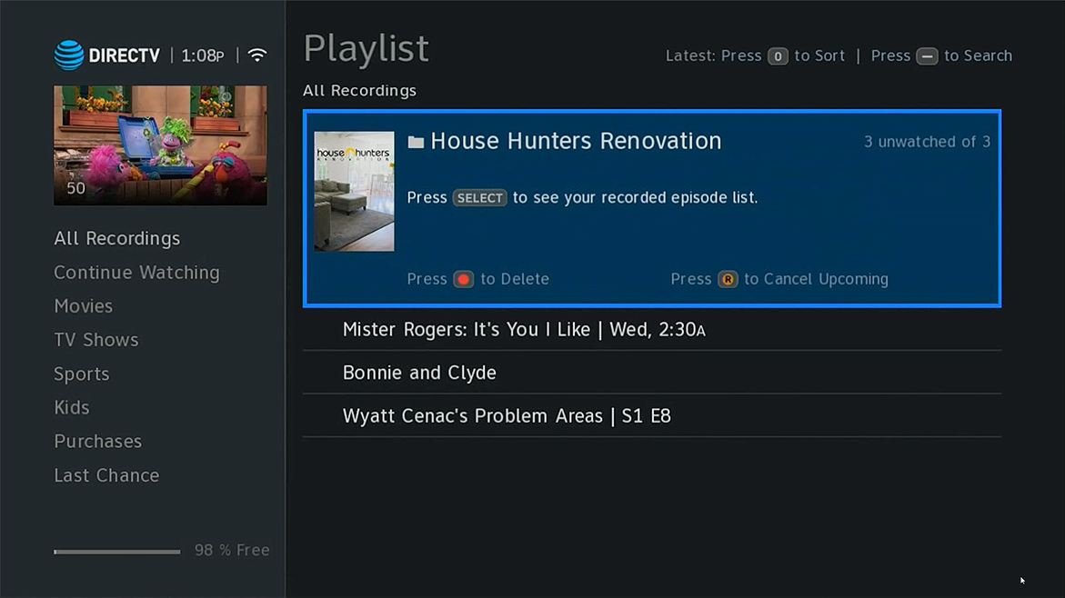
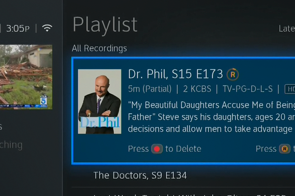
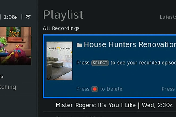
Playlist
The big difference here is the larger and thicker fonts throughout. The glow around the blue box is gone, but the box still “floats.”
OLD
NEW
COMPARISON (slide to compare)
Overall impressions
I really hope that these changes improve overall satisfaction. Personally I miss the channel logos but I was the first to point out that some channels (like the Cinemax ones) have very similar logos so the little images were almost useless. I had hoped the fade in the progress bar would go away but I can live with it since the bar itself now disappears rather quickly.
I agree with folks who said they would have liked some choices that would let you customize the guide’s size and content to take advantage of the TV you have, but I think the engineering team at AT&T has put back a lot of the legibility while keeping many of the new functions that make this new menu system better than the old one.
When will this go out to all customers?
I’m not sure of the answer to that but I know that it already has gone out to some and unless some “showstopper” problems arise, expect a pretty rapid rollout across the US.
What software version number is this? And it seems like they have a lot of empty space on the left of the channel numbers in the guide, couldn’t they slide everything over and add another half hour to it?
But overall it does look better.
Yes, it would have been helpful if you also provided your ZIP code and the software versions that you are comparing. I feel that they are probably rolling out the updates by ZIP code. It’s the only thing that makes sense. I have an HR54 and I am using a Sony Bravia TV with a picture that is so good it’s difficult to tell if I am receiving in HD or not. I am on version 0x1037 which is just terrible.
As far as I recall, the old captures were version 1037. The new software that is rolling out nationally is version 1088.
Yes, it would have been helpful to include the software version number. I am using an HR54 with a Sony Bravia HD TV and version 0x1037 is just terrible. I don’t know why it takes so long to roll out improvements. Let’s see, it took them 4.5 months to roll out the new and improved GUI (Nov. 1, 2017 until Mar. 15, 2018) for me to get it. So now I guess I’m looking at mid Nov. 2018 to get the improved version I don’t think I can last that long.
So, it looks better but that’s only about 10% of what we’re all complaining about. The big blue box? Still there. The shading that blocks out sports scores and tickers? Still there. I’m assuming there is still NOT the ability to record a series from a single channel? This sucks.
The program information is not correct/reliable. The new Masterpiece Theater POLDARK Season 4, on PBS appears as a repeat from earlier in the summer, so my DVR did not record it – I had it set to record NEW only, not reruns. Season 4 was not on during the summer. I’m glad I caught this. But, I’m paying good money for a system If you intend to keep me as a customer, you have to do better than this.
The program information is not correct/reliable. The new Masterpiece Theater POLDARK Season 4, on PBS appears as a repeat from earlier in the summer, so my DVR did not record it – I had it set to record NEW only, not reruns. Season 4 was not on during the summer. I’m glad I caught this. But, I’m paying good money for a system If you intend to keep me as a customer, you have to do better than this.