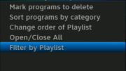
Calling the new Genie menus controversial is a bit of an understatement. Our review of them has been the most read article on our new blog and it’s also the most commented article of all time for us. So I get it, you all aren’t happy.
I’m a little surprised by the sheer amount of venom out there, but I’ve heard it from a lot of different people. Many of you find the menus hard to read, the text too small and too thin. I’m here to tell you: they hear you.
I’ve been lucky enough to see some proposals for the latest version of those new Genie menus. I can’t show them to you just yet (although I suspect it will be soon.) I understand they are out there in pilot form. What I can do, is describe the changes to you.
The text is bigger
It’s not much bigger, but the text actually gets a pixel or two bigger in a lot of areas. It doesn’t sound like it would make a difference but it does.
It’s also bolder
Overall, the menus have switched back to a bolder version of the same font. It’s actually the same font that was used in the old Genie menus but in its incredibly thin form, many people found it hard to read.
Channel logos are gone from the guide
Instead of channel logos on the left side (which can be hard to read or tell apart from each other) the short form of the network name (like DSCHD or WXYZHD) appears pretty much the way it used to. This has the side effect of making the guide faster.
Some of the “fades” are gone
Some of the fadeouts that accompanied some menus have been removed. The big grey fade behind the progress bar is still there.
There’s a little more contrast
The white is whiter and the grey is darker in a lot of menus. Not a lot, just enough to make a difference.
These little tweaks have the effect of making the menus a lot more legible. Taking out the channel logos makes them seem even more grey, which I’ll admit I don’t like. I do like the extra speed though, especially on the client boxes.
There have been complaints about the “floating blue box” which shows the selected item, as well as some mention of missing features, but those things haven’t changed as of the prototypes I’ve seen.
Want to post a picture?
I understand there are some people who have actually received these revised menus. If you want to post pictures, you can post them here, but I have a warning: If you are part of an established testing program where you’ve opted in to receiving new software, or if the software version you have is not a national release version, please don’t post them. I would have to take them down and report you to the known testing sites. Don’t make me be the bad guy. If you’re just a “regular Joe/Jane” who all of a sudden found things got a little better, I’d love to see your screen captures. As I said, I can’t post pictures of what I’ve seen.


