
As Windows 11 becomes the dominant operating system on the planet, you’ll slowly find that along with the good stuff — and there is a lot of good stuff — there’s some bad stuff. Microsoft still has a tendency to push you in directions you don’t want to go. It’s not as blatant as the Windows 8 start menu, but some of Microsoft’s “features” are really just annoying and the trick turns out to be making them go away. Luckily in most cases the new stuff can be hidden if you would like to go back to the way things were. In most cases, it just takes knowing what to do.
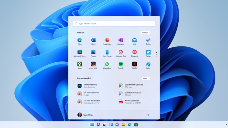
Here’s a perfect example: Microsoft puts a shortcut to Windows Explorer in the taskbar. You can put whatever shortcut there you want, but this one is sort of special as it’s the “official sanctioned one” and that seems to mean something (I don’t know what.) None of that is different, a shortcut to Explorer has been there by default for a decade. However, instead of a well-ordered list of common locations, you now get a messy quick-access menu that changes according to your usage, and a list of recent files at the bottom.
That’s great, if you like it. I think it’s a confusing mess. I want things back to where they were: Common “library” folders at top, This PC at the bottom. That’s how it was for decades. They changed things in Windows 10, and I never liked it.
Here are the steps
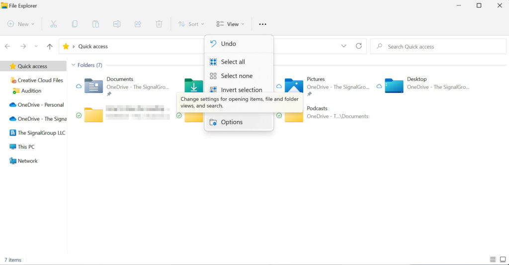
Open up a File Explorer window and choose the three dots, then Options.
Under General, change the top dropdown to “This PC.”
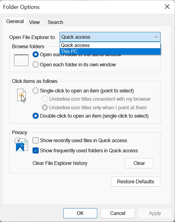
Click OK.
And that’s it! No more messy quick access menu, no more recent file list which doesn’t really relate to the files I want to open. Just a clean list of locations where I might find stuff. That suits me a lot better.
If only…
If only everything in Windows 11 were so easy to change. Overall, I don’t hate the OS. It’s really a very decent improvement in a lot of ways. It simplifies a lot of behind-the-scenes tasks, too. But I am not so fond of how they monkeyed with the Start Menu. Since 1995, the Start Menu has been the defining way to interact with Windows. I’m not saying that they had to leave it alone and let it get antiquated, but I don’t terribly care for the way it is now.
It’s not the centering. I actually don’t mind the centering. I probably would like it better at the left edge, but I do bop between iOS, Android, Chrome OS, macOS, and Windows, and all those others have the centered menu. So I’m ok with that. It’s that the menu isn’t very flexible and lacks some of the powerful features it used to have.
You might remember that in my last Windows 11 rant-fest I talked about a way out of the Microsoft Start Menu jail. It’s called Start11 and we don’t sell it at Solid Signal. (Although we do sell a lot of other awesome stuff and you ought to check us out.) It lets you customize the Start Menu pretty much any way you want, including making it look like Windows 7 if you’re that sort of person. Start11 represents the kind of customer-focused thinking that more developers need. Rather than force a unified, unpopular experience on people, give them easy options to make things comfortable for them. Hey Microsoft, are you listening?
Be the first to comment on "Fix this Windows 11 “feature” in 5 minutes or less"